29 Şubat 2016 Pazartesi
Visible country borders
Country borders visible from space.
USA - Mexico
Angola - Namibia
Guatemala - Belize
Malaysia - Brunei
Russia - China
Haiti - Dominican Republic
India - Bangladesh
Lebanon - Israel - Syria
Israel - Egypt - Gaza
UAE - Oman
Paraguay - Argentina - Brazil
Pakistan - India
Lesotho - South Africa
via Imgur
Territorial evolution of Israel/Palestine
If we look at these maps we will have a good overview of the Israeli–Palestinian conflict.
Israel from the Israeli point of view:
Jewish Loss of Land, 1000 BCE to 2013 (x)
Incredible Shrinking Israel: the extent it will go for peace (x)
Promised Land, based on God’s promise to Abraham:
"I given this land, from the river of Egypt unto the great river, the river Euphrates" (x)
Germany physical map
Physical map of Germany.
Click to enlarge
By Lencer and NordNordWest [GFDL or CC BY-SA 3.0], via Wikimedia Commons
Old World Maps
World maps through history.
Al-Idrisi’s world map in an 1154 atlas with Arabia on top:
Pietro Vesconte's world map, oriented to the east at the top, 14th century:
A map based on Ptolemy's Geographia, 1482:
Johann Ruysch's map, 1507:
Clavdii Ptolemaei Geographicae enarrationis libri octo Bilibaldo
Pirckeym hero interprete Annotationes Ioannes de Regio Monte
28 Şubat 2016 Pazar
The Cedid Atlas, 1803
The Cedid Atlas is the first comprehensive atlas compiled by the Ottoman Empire and published in Istanbul in 1803.
World
Asia
Africa
America
Europe
United States
Greece
Turkey and the Middle East
Egypt
Hemispheres
England
Scotland
French Kingdom
French Republic
Poland
Spain and Italy
Low Countries
Germany
Most popular on MapsOnTheWeb, October 2014
Most popular posts on MOTW based on the number of tumblr notes, excluding reblogs.
Old World Language Families Map - 6,647 notes
Map of Yellowstone Park drawn as a bear - 4,062 notes
Countries that recognize the state of Palestine, 2014 - 2,941 notes
Countries that look like other countries, with bonus wow content - 1,954 notes
Average Number of Languages Spoken by the EU Population - 1,806
Longest Straight Lines Without Crossing Coasts
The longest distance you can travel between two points in straight line without crossing any ocean or any major water bodies:
Source and more info
The straight line you can follow by sea. Almost 20,000 miles from Pakistan to the Kamchatka Peninsula.
Source
Most popular on MapsOnTheWeb, September 2014
Most popular posts on MOTW based on the number of tumblr notes, excluding reblogs.
How Africa Would Look Like if its Borders Were Defined By Ethnicity and Language - 17,154 notes
Countries with less population than PewDiePie’s subscribers - 10,793 notes
Prevalence of “um” vs. “uh” in the United States - 8801 notes
Favorite music artist by US state - 4037 notes
Which country last (successfully)
GDP per capita in Europe, 2015, estimates
GDP per capita in Europe in 2015. IMF estimates.
Click to enlarge
Moldova has the smallest nominal and PPP adjusted GDP per capita in Europe due to corruption, tax evasion and the undiversified economy based mainly on wine and fruit exports to Russia.
Other countries not shown on the map:
Ukraine: 4,273
Turkey: 10,504
Georgia: 3,949
Azerbaijan: 9,279
Armenia: 3,517
PPP adjusted GDP
Salar de Uyuni Map
Road network near Salar de Uyuni and Salar de Coipasa, Bolivia.
Click to enlarge
Salar de Uyuni (or Salar de Tunupa) is the world's largest salt flat at
10,582 square kilometers (4,086 sq mi). It is located in the Potosí and
Oruro departments in southwest Bolivia, near the crest of the Andes and
is at an elevation of 3,656 meters (11,995 ft) above mean sea level. (wikipedia)
Source:
CompareMaps: Comparing major map providers
CompareMaps is a great tool for comparing differences between major map providers like Google Maps, OpenStreetMaps, Bing Maps and Nokia Here Maps.
http://comparemaps.drona.ro/
Online Mapping Tools
This list is no longer maintained. For an updated list click here.
A list with online tools and libraries for creating interactive or static maps.
DataWrapper (github): An open source data visualization platform helping everyone to create simple, correct and embeddable charts in minutes.
DataMaps: Customizable SVG map visualizations for the web in a single Javascript file using D3.js
Santiago and Valparaiso
The densely populated region of Santiago and Valparaiso in Chile.
Click to enlarge
Top 20 football stadiums in the world
The 20 biggest football stadiums in the world, on a single infographic.
preview
Click to enlarge
Infographic made by Find Hold.
Continents and changing sea levels
Continental coastlines in case of a 120 m lower sea level vs an 80 m rise in sea level.
Click to enlarge
Source: NASA World Wind, mattsdfgh
South America early maps
16th century maps of South America.
Andre Thevet, 1575
Abraham Ortelius, 1570
Diego Gutiérrez, 1562
More old maps of South America >>
Departments of Bolivia
Bolivia is divided into nine departments (Spanish: departamentos). Each of the departments is subdivided into provinces (provincias), which are further subdivided into municipalities (municipios).
French Colonial Empire, 1931
Colonial Empire of France in 1931.
Click to enlarge
Blue - French territories, Red - English territories
published by Fortune Magazine, via
New England States Map
States of New England.
New England is a region in the northeastern corner of the United States consisting of the six states of Maine, New Hampshire, Vermont, Massachusetts, Rhode Island, and Connecticut. New England is bordered by the Atlantic Ocean, Canada, and the State of New York.
Provinces of Ecuador
Ecuador provinces map.
Ecuador is divided into 24 provinces (Spanish: provincias, singular – provincia).
Click to enlarge
Source: Wikimedia Commons
End of the Soviet Union
An infographic visualising the dissolution of the Soviet Union.
Click to enlarge
Source: The Guardian
Sea Level Rise Maps
This is how continents will look if all the ice on land has melted
and drained into the sea, raising it 216 feet. Creating new shorelines,
one of the effects of sea level rise.
Europe
North America
Asia
Australia
Source and more maps
Storm St Jude batters the UK
The airmass RGB imagery shows a massive outbreak of cold air over the eastern Atlantic causing the strong development of a depression over western Europe, resulting in violent winds. In the imagery the white cold frontal cloud band of storm St Jude can be seen extending from south-western England across the Channel in to the Gulf of Biscay and beyond. The red colour in its rear marks a very
World GDP forecast, 2014
GDP forecasts for 2013 and 2014 by countries, according to IMF.
THE world economy will grow by 2.9% this year and 3.6% in 2014, according to the latest estimates from the IMF. (The Economist)
GDP % change in 2013 (click to enlarge)
GDP % change in 2014 (click to enlarge)
Source: The Economist
What makes Britains weather so distinctly variable?
According to BBC News Magazine, "Britain is under an area where five main air masses meet. An air mass is
a large body of air that has similar temperature and moisture
properties throughout.".
Click to enlarge
In the UK they are either polar or tropical, depending on where the
air mass originated; they are also divided into maritime or continental,
depending on whether the air has
Comet ISON Visibility Map
Global visibility map of Comet ISON, which is a potential "comet of the century".
If ISON puts on an incredible show, it could be visible by as early as October and as late as January. But these are the times and location when ISON is most likely to be visible.
Click to enlarge
Source: HubbleSite - ISONblog
Geography of China
Geographic regions of China with elevation.
Click to enlarge
By en:User:Alanmak Alan Mak [GFDL or CC-BY-SA-3.0, via Wikimedia Commons
The Size Of Australia
Comparing Australia with other continents and countries.
Australia and North America
Australia and Europe
Australia and Africa
Australia and Russia
Australia and China
Australia and South America
Maps generated by OverlapMaps.
North Colorado: The 51st U.S. state
Officials in eight northern Colorado counties united in opposition to
the state’s new gun control laws and oil and gas regulations are
reportedly considering forming a 51st U.S. state called North Colorado.
North Colorado would have a population of more than 300,000 people, and
it would be the 42nd largest state in the country by land area. (The Economic Collapse)
Old French Atlas of America
Maps of America by Nicolas Sanson d'Abbeville, 1657.
North America
New Mexico, (island of) California
Guatemala
Carabean Islands
Florida
Mexico
South America
Terre Ferme, Nouveau Royaume de Grenade
Guyana
Peru and the river Amazon
Chile
Brazil
Paraguay
Strait of Magellan and the Magellanics Islands
Cover
How big is France?
Comparing France with other countries.
France and Central Europe
France and Scandinavia
France and the United Kingdom
France and the Balkan Peninsula
France and Eastern United States
France and Texas
France and California
France and the Middle East
France and Japan
France and Australia
Maps generated by OverlapMaps.
Is a Sleeping Climate Giant Stirring in the Arctic?
Flying low and slow above the wild, pristine terrain of Alaska's North
Slope in a specially instrumented NASA plane, research scientist Charles
Miller of NASA's Jet Propulsion Laboratory, Pasadena, Calif., surveys
the endless whiteness of tundra and frozen permafrost below. On the
horizon, a long, dark line appears. The plane draws nearer, and the
mysterious object reveals itself to be a
Mapping the Medals: Olympic Medal Distribution
Medal distribution across the globe on 2012 Summer Olympics.
http://storymaps.esri.com/stories/mappingthemedals/
Antarctica Time Zones And Stations
Time zones and research stations in Antarctica.
Click to enlarge
Centered asymmetrically around the South Pole and largely south of the Antarctic Circle, Antarctica is the southernmost continent and is surrounded by the Southern Ocean; alternatively, it may be considered to be surrounded by the southern Pacific, Atlantic, and Indian Oceans, or by the southern waters of the World Ocean. (
Distribution Of World Population
A interesting visualization of world population distribution around the globe.
http://workshop.chromeexperiments.com/globe/
OverlapMaps: Comparing places on Earth
This is a time waster too: OverlapMaps.
An Overlap Map is a map of one part of the world that overlaps a different part of the world. Overlap Maps show relative size.
United States and Europe:
Click to enlarge
http://overlapmaps.com/index.php
The Netherlands in the 16th Century
An old german map of the Netherlands, 1559-1600.
Click to enlarge
Putzgers, F.W., Historischer Schul-Atlas, Bielefeld, 1929, via The Thirty Years’ War
What European Countries Looks Like?
Creative interpretations of the shape of European countries.
Finland as a woman
Created by Zackabier
Irish Teddy Bear, by debidour
Another woman, United Kingdom, source
Slovenian chicken
via reddit/r/Europe
Exploring Israel & Palestine with the NYT
Roots of the Recent Violence Between Israelis and Palestinians is a New York Times interactive exploring the causes behind a series of recent attacks against Israel. The interactive is in the form of a story map, which provides a step-by-step guide to some of the historical and geo-political reasons for the conflict.
The map itself consists of a number of aerial views of Jerusalem and East
Indigenous Dot Map of Australia
The City Science group at Monash University has created an Indigenous Dot Map of Australia.
Every dot on the map shows an indigenous person counted in the 2011 Australian census. The map shows the spatial distribution of the 699,990 indigenous Australians counted. Indigenous Australians make up 3% of the total Australian population.
Looking at the map indigenous Australians seem to make up
Wikipedia Recent Changes Map
A real-time world map of Wikipedia edits by unregistered users.
http://rcmap.hatnote.com/#en
When an unregistered user edits Wikipedia, he or she is identified by his or her IP address. These IP addresses are translated to users' approximate geographic location. Unregistered users only make a fraction of total edits -- only 15% of the contributions to English Wikipedia are from unregistered
The 3D OpenStreetMap World of New York
CubicPower appear to be creating a 3d Doom type game world from OpenStreetMap data. CubicPower's New York Maze map is a series of thousands of small block size 3d maps of New York locations, which you can explore using your keyboard.
The CubicPower website doesn't appear to have any information about these 3d maps. They appear to be made with a WebGL powered 3d engine, with OpenStreetMap map
Mercator Distortion Puzzle
Map puzzle showing the effects of Mercator projection on the size of different objects on a map. Equatorial areas are smaller than polar areas.
http://gmaps-samples.googlecode.com/svn/trunk/poly/puzzledrag.html
Nuclear Capabilities and Potential Around the World
The Nuclear Non-Proliferation Treaty has been signed by 189 nations since its creation in 1968. It has become the international standard by which nations are judged on their commitment to nuclear non-proliferation. But the treaty has not had a perfect record. Learn more about the pread and containment of nuclear capabilities around the world.
http://www.npr.org/news/graphics/2008/feb/
China Physical Map
Geography of China with Chinese labels.
Click to enlarge
The topography of China has been divided by the government into 5 homogeneous physical macro-regions, namely Eastern China (subdivided into the northeast plain, north plain, and southern hills), Xinqiang-Mongolia, and the Tibetan-highlands. It is diverse with snow-capped mountains, deep river valleys, broad basins, high plateaus,
The Twitter Search Map
The Mapd Tweetmap allows you to search for the geographical and temporal distribution of words used in Twitter messages around the world.
Using the map you can search for any term used on Twitter and view where the word has been tweeted around the world. For example you can enter the word 'Trump' and view a dot map of all the locations where people have been tweeting the word Trump. You also
27 Şubat 2016 Cumartesi
Mapping the Battle of Jutland
This year is the 100th anniversary of the Battle of Jutland. The battle was the largest naval battle of the First World War and was fought between the British Royal Navy's Grand Fleet and the Imperial German Navy's High Seas Fleet. As a result of the battle the British lost 6,784 lives and the German's lost 3,039 men.
36 Hours: Jutland 1916, The Battle that Won the War is an interactive map
Tilting at Windmills - The Life of Cervantes
Cervantes' novel Don Quixote is "the best book in the world". However the imagined chivalric adventures of Don Quixote are as nothing compared to the real-life adventures of the novel's author Miguel de Cervantes.
Cervantes was born in Spain. In his early twenties he moved to Rome to work in the house of a cardinal. He then enlisted as a Spanish soldier and was injured at the Battle of
Maps of the Week
This week my clear favorite map was this wonderful looking map of the Grand Canyon. The Geologic Map of the Grand Canyon and Vicinity is a beautiful Leaflet.js based interactive map of the Grand Canyon. The map is based on data gathered by the U.S. Geological Survey.
The map uses different colors to show the different rock units and geologic strata in the Grand Canyon and surrounding area. The
Exploring the Solar System
Space: the final frontier. These are the voyages of the GIS specialists Esri. Its five-year mission: to explore strange new worlds, to map out new planets and new civilizations, to boldly go where no cartographer has gone before.
Esri has got a little bored with having to continually map the Earth, so they have now decided to turn their attention to the rest of the universe. The Solar System
Switching Map Labels in Leaflet
Over the last few days I've been experimenting with Map Panes in Leafet.js. There is a nice introduction to Map Panes in the Leaflet documentation if you want to learn more about how they work in the Leaflet interactive map library.
In a post yesterday I looked at how you could use Map Panes to fade map labels in and out on top of a base map. Today I started thinking about why you might want
The Stonehenge History Map
Historic England's 2002 National Mapping Project of Stonehenge added another 539 important archaeological sites around Stonehenge. About thirty percent of the newly discovered sites were prehistoric or Roman in date. These included ring ditches, field systems, round barrows and enclosures of various forms dating from prehistory.
You can now explore and download research reports from the
Leaflet Map Panes
A new feature in the Leaflet mapping platform is custom map panes, which allow you to customize the order of map features such as: the base map, map labels, markers and pop-ups.
The Leaflet documentation has a great introduction into What Are Map Panes? and includes a demo map showing how you can use z-index to order your map panes. The demo map shows you how to ensure map labels appear on top
Mapping Terrorism in the United States
The Oregonian has mapped all terrorist attacks in the United States from 1970-2014. The data for the map comes from the University of Maryland's Global Terrorism Database.
The Terrorism in the United States, 1970-2014 map uses circular markers to show the location of each terrorist attack. The color of the markers indicate where deaths, injuries or no injuries resulted from the attack. The
Urban Dictionary Map of San Francisco
Reddit user atrubetskoy has been making some popular Urban Dictionary maps lately. I particular liked his map of the Bay Area According to Urban Dictionary. In fact I liked it so much that I stole the idea.
Urban Dictionary is is a crowd-sourced online dictionary of slang words and phrases. It also seems to be a place where a lot of white middle-class kids go to describe their white,
Mapping Medieval Dublin
Dublinia is a fantastic way to explore Viking & Medieval Dublin. The site shows how the city grew from a small Viking settlement into a large walled Medieval town.
Dublinia presents an oblique view of the capital, showing how the city developed from 800 AD to 1500 AD. A timeline control allows you to view a series of oblique views of the city for every decade from 800-1500 AD. Select a date
Interactive Geologic Map of the Grand Canyon
The Geologic Map of the Grand Canyon and Vicinity is a beautiful Leaflet.js based interactive map of the Grand Canyon. The map is based on data gathered by the U.S. Geological Survey.
The map uses different colors to show the different rock units and geologic strata in the Grand Canyon and surrounding area. The map also includes contour lines. If you hover over the map the geologic strata at
Mapping the Other Mexican Border
Since 2014 the Mexican government's Southern Border Program has with, U.S. assistance, sought to lessen the numbers of 'illegal' migrants crossing the southern border of Mexico. The United States has helped Mexico in this effort with money, equipment and training. This U.S. assistance has mainly been funded through the Bureau for International Narcotics and Law Enforcement Affairs (INL).
The
The Water Risk Atlas
The World Resources Institute has released a new interactive map to visualize where and how water risks are emerging across the globe. Aqueduct allows you to explore 12 key indicators of water risk to highlight where water scarcity and water issues are, or could be, a problem in countries around the world.
The 12 key indicators can be accessed from the map side panel. You can select any of the
Open Source Conflict Mapping
PATTRN is a new open sourced conflict mapping platform developed by Goldsmiths University. The PATTRN platform allows anyone to create an interactive map which can be used to share and collate first-hand reports in conflict or crisis situations.
The platform was first used by Amnesty International in last year's Gaza Platform. The platform was used by Amnesty International to plot 2,700
Emerging Markets In The Next Decades
An infographic on why emerging economies will have the biggest role to play in the world economy growth.
Source: Jana, How Emerging Markets Will Turn The World Economy on Its Head
Two Maps for the Price of One
The Mapbox GL JS documentation has a nice new example showing how you can synchronize two maps side-by-side. Swipe Between Maps creates two synchronized maps and allows you to swipe between the two different map instances.
Swipe Between Maps could be a a nice way to showcase all the beautiful map styles that I'm sure you have been creating with Mapbox Studio. Of course you aren't limited to
NASA Study Projects Warming-Driven Changes in Global Rainfall
A NASA-led modeling study provides new evidence that global warming may increase the risk for extreme rainfall and drought.
The study shows for the first time how rising carbon dioxide
concentrations could affect the entire range of rainfall types on Earth.
Analysis of computer simulations from 14 climate models indicates wet
regions of the world, such as the equatorial Pacific Ocean and
Mapping Car Ownersip in Melbourne
A recent map by CityMetric showed that in the UK people who live in city centers are far less likely to own cars than those who live in more rural areas. A map by Monash University suggests that a similar geographical distribution of car ownership exists in Australia. At least it does in Melbourne.
The Melbourne Car Ownership Map is a dot map visualizing where Melbourne's one, two, three and
South America Vegetation
South America vegetation map.
South America is one of the most biodiverse continents on earth. South America is home to many interesting and unique species of animals including the llama, anaconda, piranha, jaguar, vicuña, and tapir. The Amazon rainforests possess high biodiversity, containing a major proportion of the Earth's species. (wp)
San Franciscos Maps of Sin
Revaluate thought that it would be rather romantic to release the Hot Beds of San Francisco Love Map for Valentine's Day. The map plots the locations of reported incidents of prostitution, lewd sexual acts, and public indecent exposure in the city.
The map provides a basic heat-map view of these reported crimes. If you zoom in on the map then the individual reported incidents appear on the map
Nuclear Weapons Map
World map highlighting countries with nuclear weapons or are suspected of pursuing nuclear weapons.
Click to enlarge
Interactive version with more info.
Locations Of Boston Marathon Explosions
The 2013 Boston Marathon bombings occurred on April 15, 2013, when two bombs were detonated during the Boston Marathon at approximately 2:50 p.m. EDT (18:50 UTC) on Boylston Street near Copley Square, just before the finish line. A third explosion at JFK library 3,5 miles away.
Click to enlarge
The two bombs at the finish line (Click to enlarge)
Sources: The Telegraph, ABC News
Indias Real-Time News Map
Rediff Labs create a lot of interactive maps of Indian data. Some of their more interesting recent maps include a map of rainfall during the 2015 Monsoon, a real-time map of Air Pollution in Delhi and a map of reported Crimes Against Women.
One of Rediff Labs' most popular maps is their real-time Breaking News Map. This map plots real-time news from all over India as it happens. The initial
Social Classes in UK
Where the new classes are clustered in England, Wales, Scotland and London.
Click to enlarge
More info: Can I have no job or money and still be middle class?
Source: @BBCNews
Is North Korea A Threat?
Threat posed by North Korea to the South and the United States.
Armed forces in the Korean peninsula
Click to enlarge
A map of how far those North Korean missiles can actually reach:
Click to enlarge
Sources: AFP and Washington Post
The New Years Eve Attacks in Cologne
Over 500 complaints of sexual assault have now been reported to the police in Cologne, all occurring during the city's New Year's Eve celebrations. This shocking number of attacks, the vast majority carried out by immigrants of Algerian, Tunisian and Moroccan origin, has caused a backlash against Angela Merkel's 'Open Door' policy on refugees (although only three of the 58 men arrested so far
Comparison of European Bailout Packages
Comparing the bailout packages of troubled euro zone countries.
Click to enlarge
In addition, an easy-to-understand article about failed banks:
Bailouts, Bail-ins, Haircuts and All That: Program Notes for the Cyprus Banking Drama
Source: reddit europe
Amazon River Map
Physical map of Amazon river basin.
Click to enlarge
The Amazon River in South America is the second longest river in the world and by far the largest by waterflow with an average discharge greater than the next seven largest rivers combined (not including Madeira and Rio Negro, which are tributaries of the Amazon). The Amazon, which has the largest drainage basin in the world, about
Billionaires World Map
The wealth Forbes' billionaires mapped.
Click to enlarge
For the 27th annual Forbes billionaires list, our team of reporters spent months tracking down the wealthiest people around the globe. Ultimately, we found 1,426 billionaires who are together worth a total of $5.4 trillion — a record sum.
The combined wealth of billionaires from the United States, $1.87 trillion, is larger than the
Maps of the Week
I've had a lot of fun this week exploring the geographical distribution of place-names with Places!. Places!
allows you to map the relative density of place-names in different countries around the world. Using the application you can enter place-name prefixes or suffixes and view a map showing the geographic distribution of place-names containing those terms.
For example, in the UK we can
Map of the countries that are most and least welcoming to foreigners
Click to enlarge
Buried several hundred pages into a new World Economic Forum report on global tourism, past the sections on air travel infrastructure and physician density (by which they mean the number of physicians per capita, not the mass-per-cubic-meter of individual doctors), are some very interesting numbers. The WEF has compiled survey data from 140 countries estimating the attitude
10 nice postcard map from the Netherlands
1. The Netherlands / Nederland
2. The Netherlands / Nederland
3. The Netherlands / Nederland
4. Groningen
5. Limburg
6. Friesland
7. Schouwen-Duiveland
8. Nijmegen
9. North Brabant / Noord-Brabant
10. Overijssel
Source: The Netherlands/Holland on postcards, http://www.flickr.com/groups/815639@N23/
Looking for Love? Try these Singles Maps
This week, with one eye on Valentines Day, a number of interactive maps were released that show where all the single men and women live.
The Map of French Singles visualizes the proportion of single men and women in every French department. If you are a young single French woman then the map is good news. It shows that in the 20-29 age group there are lots of single men across the whole of
Every meteorite fall on earth mapped
After the meteor explosion in the sky above Russia's Ural Mountains the Guardian Data Blog:created a map with every meteorite falls.
Or at least those we know about. And where are the known meteorite
landing places on earth? These impact zones show where scientists have
found meteorites, or the impact craters of meteorites, some dating back
as far as the year 2,300BC. The data is from the US
Simulate a nuclear explosion in your city
Select a place on the map, set the yield of the nuclear weapon and see the destruction.
http://www.nuclearsecrecy.com/nukemap/
The Muslim World, old map
An 1900's map and infographic of the Muslim world with population data of "countries having 2,000,000 or more Mohammedan population".
Click to enlarge
Source: S.M. Zwemer, The Moslem World, Student Volunteer Movement For Foreign Missions, Publishing House of the M.E. Church, South, 1908
The Worlds Most Boring Roads
I have a new theory. The world's most interesting roads are in mountainous areas and the most boring roads are in areas which are very flat.
My theory is based on two interactive maps which show where the world's straightest and bendiest roads are. How Straight or Bendy are the Roads and tortuOSMity both use OpenStreetMap data to calculate the relative straightness of roads. Each map uses a
London from space
London from space at night. Picture made by Canadian astronaut Chris Hadfield from International Space Station in February, 2013.
Click to enlarge
New York Snowfall Reports
An interactive map with snowfall reports in New York area.
http://project.wnyc.org/snowfall-map/embed.html#9.00/41.1293/-73.4160
Find Somewhere to Live with Google Maps
When you're looking for somewhere new to live you don't just want the perfect property you also want it in the perfect area. What makes a perfect neighborhood will be different for different people. In deciding the perfect neighborhood, however, you might consider a number of criteria, such as the crime rate, the commuting time to work, good local schools, public transit links and the 'charm'
Interactive map of worlds most liveable cities
This interactive map shows the quality of living rankings for the top city in countries around the world from the Mercer survey. Please note that only those countries and cities are included for which information was made publically available. It includes all countries which have cities in the top 50 ranking, as well as the top cities in the Americas, Asia-Pacific and Middle East and Africa
The Shadowhunters Map
Whether you're an angel or demon you are sure to enjoy the Map of Shadows. The Map of Shadows allows you to explore a map of New York through the eyes of either a Mundane or a Shadowhunter.
The map includes locations featured in episodes 1-5 of Freeform's Shadowhunters television series. When viewing the map you can choose to be either a Mundane or a Shadowhunter. A different Mapbox Studio map
The Cassini Map of France
The Carte de France or the Cassini Maps were created by four generations of the Cassini family in the 18th and 19th centuries. The Cassini Maps were the first truly accurate national survey based on geodetic triangulation.
Remonter le Temps (go back in time) allows you to view the Carte de Cassini overlain on top of a modern interactive map of France. This historical maps interface presents a
26 Şubat 2016 Cuma
Street View - Gold Edition
You can now explore Rome at night with this Bulgari - Roman Treasures tour of the eternal city. To be honest the website is little more than a very slick promotional campaign for Bulgari's products. However it does highlight the great leaps and bounds that have made in the last two years in creating fully interactive 'Street View' tours.
Bulgari - Roman Treasures presents a number of 360
The Hoax Map of Migrant Myths
Angela Merkel's 'open door' policy for welcoming migrants from Syria, Iraq and elsewhere has been a brave humanitarian response to the migrant crisis facing Europe. The policy has not come without some negative cost to Merkel's own popularity in Germany. TIME named her their Person of the Year for her handling of the refugee crisis. However in Germany Merkel's personal rating among voters has
Mapping the Rise of The Railways
The Campaign for Better Transport has released an interactive map which shows the huge increase in rail traffic in Great Britain over the last 18 years.
The Rail Travel Station Usage 1997-2015 map visualizes annual rail passenger traffic for each year since 1997. In those 18 years rail traffic in Great Britain has increased by 1.45 billion annual passenger journeys. The Rail Travel Station
Easy Story Maps with Mapme
You can now easily create your own story maps with Mapme. Mapme's Google Maps based creation tool is great way to create your own free maps without having to do any coding. Mapme Stories is a new feature which allows you to quickly and easily make your own scroll-driven stories with maps.
Scroll driven maps are a great way to create a story about a location, spatial data, an historical event
Mapping the Garden of Earthly Delights
I've always wondered why interactive mapping platforms have not been used more often to provide interpretations of works of art. Paintings can be easily imported into all the popular mapping platforms. You can then use all the navigation tools of an interactive map to explore features in the painting.
You can see what is possible in The Garden of Earthly Delights by Hieronymus Bosch - An
Map Quiz Time - Accents
Do you know your Brummie from your Scouse? Or your Geordie from your Cockney? You can find out with Expedia's Accent Map of the British Isles.
In Expedia's quiz you are played a series of spoken phrases. Your job is to detect the accent and select where the speaker is from, from a choice of three locations on a Mapbox map.
If you don't want to play the quiz then you can choose to explore the
Oblique Satellite Views of San Francisco
Back in December The Atlantic released a really interesting map containing an oblique satellite view of Denver and the Colorado Rockies. The map used a rare satellite image captured by WorldView-3 to provide an alternative to the usual top down satellite views provided on interactive maps.
Mapbox has now created a similar oblique satellite view map, this time of San Francisco. The satellite
The Alps of Berlin
Hans Hack has created a number of impressive mapped visualizations of some of Europe's largest cities. There's something a little different however about these maps. Or rather there's a big difference - in these maps all the elevation data has been hugely increased in scale.
The result is that in Hans Hack's Alpen maps Europe's cities are dominated by towering mountains. For example, in
The Paris Building Age Map
Paris is the latest city to be added to Maps Mania's ever growing directory of building age maps. BatiParis: Période de Construction des Immeubles Parisiens maps the age of buildings in central Paris. It is also a rather good example of the building age genre of interactive mapping.
Like other building age maps BatiParis uses a choropleth layer to show the age of buildings, with each building
Real-Time Pedestrian Maps
There are now many interactive maps which show the real-time movements of trains. buses and trams on transit systems around the world. Over the years Maps Mania has reported on hundreds of these real-time transit maps. This is the first time we have reported on a map which shows pedestrians moving in real-time.
Placemeter has created a real-time map of pedestrian and bike traffic in Union
Time for Work
Why are so many people in Humboldt County, Nevada leaving for work before 5am? It's just plain wrong. They should learn from the residents of Grand County, Colorado, where the favorite time for leaving home for work is between 9am and 10am.
When Do Americans Leave For Work? is an interactive map from Flowing Data, showing the times people leave for work at county level in the USA. As you might
The Distribution of Placenames
I've always wanted to create a map that visualized the geographical distribution of place-names. bgrsquared has now made that map.
Places! allows you to map the relative density of place-names in different countries around the world. Using the application you can enter place-name prefixes or suffixes and view a map showing the geographic distribution of place-names containing those terms.
For
Maps in the Age of Cholera
Twenty Years before John Snow famously mapped the locations of cholera victims in Broad Street, London, Robert Baker plotted the deaths of cholera victims in Leeds.
Maps in the Age of Cholera is a story map based around Robert Baker's 'Sanitary Map of the Town of Leeds' exploring the 1832 cholera epidemic in the Yorkshire town. Baker never made the link between cholera and contaminated water.
The Maps of the Week
My favorite map of the last week hasn't even dented the top ten most read posts on Maps Mania over the last seven days (you can see the list in the right-hand panel of this page). So let's give it another go.
Project Ukko is a beautiful new mapped visualization of seasonal wind predictions. The map is a visual interface which provides industry, energy traders, wind farm managers and others
Great Salt Lake Map
The Great Salt Lake, located in the northern part of the U.S. state of Utah, is the largest salt water lake in the Western Hemisphere, and the fourth-largest terminal lake in the world. (wp)
Click to enlarge
Super Bowl Twitter Champions
The winners of the Super Bowl Twitter Championship are the Carolina Panthers. The Panthers played a great pre-game and there was really only one team in it. The Denver Broncos did manage to beat the Panthers in Colorado but the Panthers managed to take most other states.
The #SB50 Twitter Fan Map shows which of the two Super Bowl teams have been Tweeted about the most in every U.S. state. You
Map of Cadiz, Spain
Click to enlarge
Cadiz is a city and port in southwestern Spain. It is the capital of the homonymous province, one of eight which make up the autonomous community of Andalusia. (wp)
Asteroid 2012 DA14 will pass very close to Earth
Asteroid 2012 DA14 will pass very close to Earth-much, much closer than the moon-on Feb.15.
Source: WSJ News Graphics @WSJGraphics
Visibility map of 2012 DA14:
Click to enlarge (Source: Geert's research blog)
Discovered by the LaSagra observatory in southern Spain, the small
asteroid 2012 DA14 will pass within about 3.5 Earth radii of the Earth's
surface on February 15, 2013.
Your Source for Vintage Map Tiles
I noticed yesterday that Wikimedia is using Tim Waters' Map Warper to geo-rectify old historic maps. This means that map developers have another great resource for accessing map tile schemes of vintage maps from around the world.
Today I used some of the geo-rectified vintage maps on Wikimedia to put together this little collection of old historical maps of Berlin.
The NYPL Digtial Collection
Australia Postcard Map 1.
Click to enlarge
Australia, officially the Commonwealth of Australia, is a country comprising the mainland of the Australian continent, the island of Tasmania and numerous smaller islands. (wp)
The Vintage Maps of Berlin
Once upon a time, a long, long time ago two old towns sat on opposite sides of the River Spree. To the south the town of Cölln looked longingly across the river at the town of Altberlin. Altberlin stared back across the flowing waters at Cölln with love in its heart.
Like all love stories this tale of passion also has a happy ending. To cut a long story short the towns of Cölln and Altberlin
Extent of German Occupation in World War 2
Europe and the maximum extent of German occupation.
Click to enlarge
Collins Australian Clear School Atlas, Europe. Published 1940. Overprinted 1945.
Mapping the Changing Landscape
Tidskikaren is a fascinating interactive map which allows you to explore the dramatic changes in the landscape around the Julita Museum, in Södermanland Sweden, over the last four centuries.
The map includes a timeline which allows you to view the changing landscape over the centuries and a number of layers which allow you to view the changes to arable land, forests, meadows and pastures (or
Rebels Move Into Southern Mali
Al Qaeda-backed rebels have edged into southern Mali, stoking fears of an expanding conflict.
Source: @WSJGraphics
St. Lawrence River Map
Map of Saint Lawrence River basin.
The Saint Lawrence is a large river flowing approximately from southwest to northeast in the middle latitudes of North America, connecting the Great Lakes with the Atlantic Ocean. (wp)
Click to enlarge
The Geography of Zipcodes
The Interactive ZipScribble Map connects all the Zip or postal codes in a country in ascending order. The resulting map provides a visual representation of how countries around the world arrange or order their post code systems.
If you view the ZipScribble map of the USA, you can immediately see that zipcode density appears to closely follow population density (the more people that there are
Canada, 19th century
Provinces and territories of Canada at the end of the 19th century.
Click to enlarge
Census Dotmap
A map of every person counted by the 2010 US Census. The map has 308,450,225 dots - one for each person.
http://bmander.com/dotmap/index.html
Whistle Up the Wind
Project Ukko is a beautiful new mapped visualization of seasonal wind predictions. The map is a visual interface which provides industry, energy traders, wind farm managers and others with a way to access predictions about future wind conditions.
On the map you can drill down to view regional wind forecasts at a detailed level. The line symbols on the map represent predicted wind speed
Oahu Tourist Map
A map of activities in Oahu and ideas for tourists what to do in Oahu.
Click to enlarge
Map from "Honolulu Handy Guide," published by Tongg Publishing, 1978.
Run Around the World on Google Maps
Australian Tom Denniss ran around the whole world in just 622 days. This is a new world record. In total Deniss ran 16,300 miles and passed through 18 countries.
40 Million Steps: A Run Around the World is a story map put together by Runner's World which allows you to follow Denniss' route around the world. While following his journey you can also view some of the photos, videos, audio clips
American Oil Imports
Oil imports to the United States. The top 10 exporting countries of oil to the US in thousand barrels per day (June 2009).
Click to enlarge
Source: NG Oil and Gas
Mapping 3 Billion Journeys
This week around 2.9 billion trips will be made in China by people travelling to celebrate the Chinese Lunar New Year with their families. You can see where and when they travel during this year's Spring Festival on this interactive map from Baidu.
Baidu's mobile maps has over 350 million active users and receives over 10 billion location requests every day. This provides Baidu with a unique
United States Precipitation Map
Average annual precipitation in the US, 1971-2000.
Click to enlarge
Data source: PRISM Climate Group, Oregon State University. Map created by Jacob Morgan.
European Overseas Territories
European Union overseas countries and territories and outermost regions.
Click to enlarge
The World Divided, 1941
The World divided during World War 2 (July 1941).
Click to enlarge
The political alignments of the world are here shown, centering geographically around the North Pole but ideologically and economically around the U.S. The classification keyed below is necessarily simplified and does not of course meet all the subtleties of politics and diplomacy - for instance, the peculiar position of
Adult Coloring Maps - Part 3
Last summer the the UK's Ordnance Survey invented the concept of the coloring map. The Ordnance Survey had noticed the huge popularity of adult coloring books and realized that what the world was waiting for was adult coloring maps.
They therefore released a series of black and white maps
as free PDF files. The Ordnance Survey Blog created 11 maps which you can print out and then spend hours
Istanbul, Turkey by SkyMap
An interactive isometric map of Istanbul, Turkey with a lot of information, including restaurants, bars, clubs, historical sites, hotels and other points of interest.
http://www.skymap.com.tr/
Pictures Of Earth At Night
Pictures of Earth at night made by NASA's Suomi NPP satellite.
Earth’s city lights is a composite assembled from data acquired by the Suomi NPP satellite. The data was acquired over nine days in April 2012 and 13 days in October 2012. It took 312 orbits to get a clear shot of every parcel of Earth's land surface and islands. (Source: Nasa)
Composite map of the world assembled from data
Nuke Your Town
Have you ever felt like dropping a nuclear bomb on your hometown? Well don't!
However you are allowed to use these maps to find out what the consequences of a nuclear strike would mean for your town.
The Hiroshima Game (urgh!) lets you select any location in the world and view the likely devastation caused. After you drop the virtual bomb on a location you can view the damage caused via a
Map Fail: China in North America
China moved to North America on a welcome map.
http://studymorechinese.com/photo/geography-fail-qingdao-center-of-universe-map-puts-china-in-usa
UN Recognition of Palestine on Maps
The United Nations General Assembly voted to approve a resolution to upgrade the status of the Palestinian Authority to a non-member observer stat. The U.N. General Assembly voted 138-9 with 41 abstentions
Twitter/Avaaz
Twitter/Caabu
The rise of megacities – interactive map
By 2025, the developing world, as we understand it now, will be home to 29 megacities. We explore the latest UN estimates and forecasts on the growth of these 'cities on steroids', and take a look at the challenges and opportunities megacities present for the tens of millions living in Lagos, Mexico City and Dhaka.
http://www.guardian.co.uk/global-development/interactive/2012/oct/04/
Compare the Weather Map
The Global Weather Comparison map allows you to compare the weather between different locations around the world. The map allows you to pick two different weather stations, from more than 14,000 locations world-wide, and compare their temperatures, rainfall and hours of sunshine.
To compare the weather of two different locations you just need to click on their markers on the map. The complete
25 Şubat 2016 Perşembe
Side-By-Side Synchronized Maps
geteach.com allows you to compare two synchronized Google Maps side-by-side. This allows you to quickly and easily compare two different map layers.
The idea of synchronizing two different interactive maps is almost as old as the Google Maps API. What I really like about geteach.com however is its large collection of map layers that you can choose to compare. I particularly like the great
Mapping the Spread of Zika
At the time of writing the World Health Organization are meeting to decide whether to declare the Zika virus a "public health emergency of international concern". You can learn more about the Zika virus on Frontline's new story map, The Spread of Zika.
The map documents the spread of the Zika virus across many parts of the world since it was first detected in a rhesus monkey in the Zika
The Worlds 50 Busiest Airports
Geographica has mapped the world's 50 most busy airports. Using the Flight Routes Around the World interactive map you can compare the number of flights and passengers handled by any two of the world's busiest airports.
To compare two airports just select them from the drop-down menu's at the top of the map. Once you have selected the two airports the number of routes and the annual number of
Post Apocalypse Street View
After the smallpox pandemic swept across the country it took only five days for the U.S. government to fall and for the country to descend into chaos. The only hope remaining is the Strategic Homeland Division (aka The Division), a clandestine group of agents who are determined to restore order.
News about the Division's progress is obviously a little sketchy. However it is possible to view a
Maps of the Week
Elevation data played an important role in two of my favorite maps this week. Mundialis is a beautiful new interactive topographical map of the world and XG - Earth Bathymetry is a WebGL globe showing planet Earth without all its water.
The Earth Bathymetry globe uses data from NASA's Blue Marble to provide a view of the undersea land surface and water depth. The shading of the sea floor
Transcribing Tithe Maps
You can help the Cynefin Project digitize around 1,200 tithe maps by transcribing and geo-referencing a collection of 19th century maps of Wales. By contributing to this crowdsourcing effort you will help to create an online resource which will enable anyone to access and research Welsh tithe maps.
The Welsh tithe maps were created between 1838 and 1850 to show where land users were
The Washing Machine Capital of the World
Atlas Obscura had a lot of success last year with their Punny Businesses in America map. The map was a crowd-sourced map of local businesses which use a little word play in their titles (such as the Slim Chickens restaurant in Fayetteville, AR).
Atlas Obscura's latest map is an attempt to locate towns and cities around the world which try to claim a little notoriety through the use of a 'World
Mapping Boston Bus Speed
This Leaflet powered map visualizes Boston bus speeds over the last three hours. The map uses the real-time GPS data from MBTA buses to plot the routes and speeds of the city's buses.
The MBTA Bus Speeds map actually takes the discreet location reports provided by the MBTA, which are sent at regular intervals. Therefore the map works out the speeds based on the time taken to travel between
Explore the World from Above
The View from Above is a very beautifully realized promotional website from the Emirates airline. The website consists of a number of aerial videos of locations around the world, which you access from a 3D interactive globe.
The aerial videos are themselves pretty wonderful but what I really like about this site is the map markers and the transition between the markers and the actual videos.
Mapping the Zika Virus
The World Health Organization has established an emergency committee in response to the explosive spread of the Zika virus in the Americas. The virus has now affected people in 23 countries in the Americas. You can view a static map of the countries with active Zika virus transmission on the Centers for Disease Control and Prevention website.
The Zika virus causes an illness similar to dengue
The Belarus History Map
The Map of Belarus aims to tell the story of Belarus since the 13th century. It provides a general overview of the country's history and its various rulers and leaders. It also shows how the country's border has changed over the centuries.
As you scroll down on the Map of Belarus you move through its historical timeline. The timeline provides the dates of the reigns of Belarus' leaders and
Mapping Culture Under Threat
In the Middle East and North Africa ISIS is not only attempting to destroy lives and communities it is also targeting many cultural and historical artifacts in an attempt to destroy cultural histories which fail to conform to their narrow interpretation of the Koran. These attacks have targeted important historical sites and artifacts of Muslims, Christians and many other ethnic groups.
Mapping Creationism in Schools
Apparently in the USA the state actively funds the teaching of creationism. Slate's Publicly Funded Schools That Are Allowed to Teach Creationism map shows where public schools are receiving tax payers' money for teaching alternatives to the scientific truth.
The map uses three different colored map markers to indicate different types of schools. These are: public schools in states which
Mapping the Ice Age
The last Ice Age occurred 110,000 to 12,000 years ago. The Last Glacial Maximum (LGM) was the last period in this Ice Age when the ice sheets were at their greatest extension. This was around 26,500 years ago.
Thanks to the Swiss federal mapping agency you can now view a 2.5D map of how Switzerland looked during the Last Glacial Maximum.
You can view the Swiss LGM map in 2.5D, on a WebGL
Thüringen Map
Physical map of Thüringen / Thuringia, Germany. Thuringia is a federal state of Germany, located in the central part of the country.
Karte von Thüringen.
Click to enlarge
Tourismusverband Thüringer Wald-Gothaer Land e.V
Noisy New York
CartoDB has released a really great mapped visualization of 311 noise complaints in New York. The map allows you to explore the number of complaints made to New York's non-emergency service hotline by location, time of day, type of noise complaint and by season of the year.
The Noise in New York map starts with a very useful introduction which guides you through some of the filtering options
Migrant Routes in Europe & South East Asia
MOAS is a charity dedicated to saving the lives of refugees at sea. The charity was established after the October 2013 disaster when 400 men, women and children drowned off the Italian island of Lampedusa,
The MOAS website includes a number of interactive maps designed to explain the migration routes into Europe & in the Bay of Bengal, and the work MOAS is doing along those routes to rescue
United States Western Expansion
Map of the western expansion of United States in the 18th and 19th century.
Click to enlarge
The map including Florida Cession from Spain (1819), Louisiana Purchase from France (1803), Texas Annexation (1845), Mexican Cession (1848), Gadsden Purchase from Mexico (1853), Oregon Country Annexation from Great Britain (1848) and other territorial gains from 1783 to 1853.
Aral Sea Map
Physical map of the Aral Sea (2007).
Formerly one of the four largest lakes in the world with an area of 68,000 square kilometres (26,300 sq mi), the Aral Sea has been steadily shrinking since the 1960s after the rivers that fed it were diverted by Soviet irrigation projects. By 2007, it had declined to 10% of its original size, splitting into four lakes – the North Aral Sea, the eastern and
Wyoming County Map
Counties of Wyoming.
Wyoming is a state in the mountain region of the Western United States. Wyoming is the 10th most extensive, but the least populous and the 2nd least densely populated of the 50 U.S. states. (wp)
Click to enlarge
A World Without Water
XG - Earth Bathymetry is a WebGL globe showing planet Earth after someone has pulled out the plug and drained the world of all its water.
The globe uses data from NASA's Blue Marble to provide a view of the undersea land surface and water depth. The shading of the sea floor indicates changes in slope or depth. If the blue coloring of the oceans' floors confuses you then you can click your
Muturzikin.com Linguistic Maps
A large collection of detailed linguistic maps from Muturzikin.com.
Linguistic maps of Basque Country, Africa, America, Asia, Europe & Oceania. We provide useful and practical information for thousands languages displayed on specific geographic areas.
http://www.muturzikin.com/countries.htm
Europe Climate Map
Map of climate in Europe.
The climate of Europe is of a temperate, continental nature, with a maritime climate prevailing on the western coasts and a Mediterranean climate in the south. The climate is strongly conditioned by the Gulf Stream, which keeps mild air over the high latitude northwestern region over the winter months, especially in Ireland, the UK and coastal Norway. (wp)
Click to
What a Relief
Mundialis is a beautiful new interactive topographical map of the world.
The map uses SRTM DEM 450m elevation data, and bathymetry sea & lake data (from Natural Earth & NGDC respectively). The map also includes the option to view an OpenStreetMap road map layer on top of the topographical map or on its own as the base map.
Currently the map includes a small inset map showing the global
North Dakota County Map
Counties of North Dakota.
North Dakota is a state located in the Midwestern region of the United States, along the Canadian border. It was created from the northern portion of the Dakota Territory and admitted to the Union on November 2, 1889, simultaneously with South Dakota. (wp)
Click to enlarge
The Glittering Red, White & Blue
Japan's Himawari-8 satellite is in stationary orbit over New Guinea where it captures some truly amazing imagery of the Earth. Every day the satellite captures imagery of the western Pacific, Australia, and parts of Asia, Antarctica & Alaska
Glittering Blue is a time-lapse video of Himawari 8's imagery from just one day. The video shows 24 hours of imagery from August 3rd 2015 in 12 seconds.
Arctic Ocean Map
Physical map of Arctic Ocean.
The Arctic Ocean, located mostly in the north polar region, is the smallest of the world's five oceans, and the shallowest. Even though IHO recognizes it as an ocean, oceanographers may call it the Arctic Mediterranean Sea or simply the Arctic Sea, classifying it as one of the mediterranean seas of the Atlantic Ocean. (wp)
Click to enlarge
Pictorial Map of Japan
A pictorial map of Japan with cities.
Japan is a country in East Asia situated between the Pacific Ocean and east of the Korean peninsula. Its name, often translated as "The Land of the Rising Sun," comes from China and refers to Japan's eastward position relative to the Asian continent. (Wikipedia)
Click to enlarge
Vermont County Map
Counties of Vermont.
Vermont is a state in the New England region of the northeastern United States. Vermont is the 6th least extensive and the 2nd least populous of the 50 United States. It is the only New England state not bordering the Atlantic Ocean.(Wikipedia)
The Top 10,000 Academic Texts
The Open Syllabus Explorer is an interactive map of the top 10,000 texts used in academic syllabi. It shows the most used texts in different university subject areas based on an analysis of over one million syllabi collected from university websites.
The map consists of 10,000 texts subdivided into academic subject categories. I think the size of each text's circle on the map is related to
Eastern Mediterranean Map
Map of Eastern Mediterranean , Western Middle East.
Click to enlarge
Source: Readers Digest Illustrated Great World Atlas
Vision Zero Boston
Boston has initiated a project to eliminate all fatal and serious traffic accidents in the city by 2030. Vision Zero Boston aims to examine the causes of traffic accidents and implement policies to make Boston’s streets more walkable, bikeable, and transit-friendly.
Part of the Vision Zero initiative is to canvas the opinions of people in the city and to identify safety issues on Boston's
Mount Everest Maps
A collection of maps of Mount Everest.
Mount Everest, measuring from sea level, is the tallest mountain on Earth. The summit ridge of the mountain marks the border between Nepal and Tibet. In Nepal the mountain is called Sagarmatha (forehead of the sky) and in Tibet Chomolangma (mother of the universe); and although it was named Everest by Sir Andrew Waugh, the British surveyor-general of India
Montana County Map
Counties of Montana.
Montana is a state in the Western United States with 56 counties. The western third of Montana contains numerous mountain ranges. Smaller "island ranges" are found in the central third of the state, for a total of 77 named ranges that are part of the Rocky Mountains. This geographical fact is reflected in the state's name, derived from the Spanish word montaña (mountain).(
Ich Bin Kein Berliner
The majority of Berliners were not originally born in the city. The Berliner Morgenpost's new interactive map, Zugezogenen Atlas, allows you to explore where these newcomers to Berlin were originally from.
The map shows locations around the world where at least 100 Berliners were born, based on the population register of June 2015.
Hamburg, Dresen and Leipzieg are the top three German cities
Rhode Island County Map
Counties of Rhode Island.
Rhode Island, officially the State of Rhode Island and Providence Plantations, is a state in the New England region of the United States. Rhode Island is the smallest in area, the eighth least populous, but the second most densely populated of the 50 U.S. states behind New Jersey. (Wikipedia)
Click to enlarge
NYT: The New World
Interactive map of what could possibly be the world’s newest international borders, by The New York Times.
http://www.nytimes.com/interactive/2012/09/23/opinion/sunday/the-new-world.html
IT has been just over 20 years since the collapse of the Soviet Union and the last great additions to the world’s list of independent nations. As Russia’s satellite republics staggered onto the global
Maps of the Week
On an average day the Moscow Metro wi-fi network can see up to 70 TB of internet traffic. The Moscow Metro Wi-fi Map is a beautiful mapped visualization of all those wi-fi users as they travel around the city.
By tracking wi-fi users Moscow Metro are able to observe how passengers navigate the Moscow metro system. They can see how passengers travel around the system from the time that they
The Atlas of True Names
Map samples from The Atlas of True Names.
Click to enlarge
See zoomable world map.
Buy here.
Snow Plow Maps
If you want to know how long ago the roads around you have been cleared of snow then you can check out these snowplow maps.
Both the PlowNYC and Washington DC Snowplow map color city streets based on when they were last cleared. The PlowNYC map includes a legend about what the different colors indicate. Showing how many hours ago individual streets were cleared. On the Washington DC Snowplow
New Hampshire County Map
Counties of New Hampshire.
New Hampshire is a state in the New England region of the northeastern United States of America. The state was named after the southern English county of Hampshire. (Wikipedia)
Click to enlarge
Africa Population Density
Map of population density in Africa.
The population of Africa has grown rapidly over the past century, and consequently shows a large youth bulge, further reinforced by a low life expectancy of below 50 years in some African countries. (Wikipedia)
Click to enlarge
Alaska Highway Map
Map of the Alaska Highway.
The Alaska Highway was constructed during World War II for the purpose of connecting the contiguous U.S. to Alaska through Canada. It begins at the junction with several Canadian highways in Dawson Creek, British Columbia and runs to Delta Junction, Alaska, via Whitehorse, Yukon. (Wikipedia)
Click to enlarge
Snow Totals on the Map
If you want to know how much snow has fallen on the Eastern United States then the simple answer is a lot. According to the New York Times' How Much Snow Has Fallen map parts of West Virginia have received 40 inches of snow.
The NYT's map uses data from the National Weather Service and shows snow fall totals when they were last recorded at each weather station.
The National Weather Service
24 Şubat 2016 Çarşamba
The London Building Heights Map
The Building Heights in London map is a great advertisement for vector maps. Up until a few days ago this map was incredibly taxing on the browser and almost impossible to navigate. Now all the building height data has been added to the base map as vector tiles and it works like a dream.
The map uses data from the Environment Agency's open LIDAR data. As you might expect the map shows that the
Here Comes the Snow
Mapbox has mapped the winter storm spreading across the east coast of the USA. The map animates water equivalent accumulated snow depth data from NOAA’s High Resolution Rapid Refresh Model.
If the snow keeps you housebound this weekend then you might want to try and replicate this map yourself with Mapbox GL. The map uses the Mapbox GL video overlay capabilities to create an animated map of
Mapping Missing Airplanes
Vanished Aeroplanes is a CartoDB created map of aircraft which have gone missing around the world. The map says that 'all positions are approximate' so my guess is that the panes have been mapped to their last known locations.
Looking at the map my immediate thought was that there appears to be a cluster of planes which have gone missing around the 'Bermuda Triangle', the Carribean and Central
India Night Lights
11.3% of Indians live without electricity. Luckily we have twenty years of night-time satellite imagery to help identify those rural areas of India which don't appear to have electricity, The World Bank and the University of Michigan have collaborated to analyse this satellite data for 600,000 villages across India.
India Lights is an interactive map which shows the results of that analysis.
How to Make a Hexagonal WarGames Map
If you liked the WarGames Dashboard, that was featured on Maps Mania last week, then you might be interested in creating your own WarGames map style.
Here's a quick tutorial on making a WarGames map using Mapbox Studio. Before getting started you can check out the finished map here.
1. The Base Map
The base map for the WarGames map comes from Project Linework. Project Linework have made a
Where Can I Fly?
WhereFor is a useful online application for finding out where you can travel to on a budget. Just tell WhereFor how much money you have to spend and it will show you a map of destinations that you can afford to fly to and book an hotel within your budget.
Using WhereFor is very simple. You simply need to enter the airport you wish to travel from, the dates you want to travel and how much money
Climb Mont Blanc on Street View
You can now climb the highest mountain in the Alps from the comfort of your own home using Street View. Google has teamed up with a group of alpine photographers, climbers and skiers to bring you some stunning panoramic imagery from Mont Blanc.
climbing a serac
Google's latest Alpine Street View includes vertiginous imagery from the actual climb and some stunning panoramic views from the
The Curious Case of Typhoid Mary
Mary Mallon was the first identified carrier of typhoid in the United States. From 1900 to 1907 Mary worked as a cook for seven different families in New York and Long Island. While Mary was employed as a cook in these different households, members of the families would develop typhoid fever. It is believed that she infected at least 51 people during her cooking career.
George Soper, a typhoid
Submarine Cable Maps
Every year Telegeography creates an updated undersea cable map of the world. The 2015 Submarine Cable map was inspired by medieval and renaissance cartography and features not only a vintage map style but sea monsters, map border illustrations
and images showing some of the common causes of cable faults.
The map shows 299 submarine cable systems across the globe, that are active or are under
The History of New Yorks Grid Map
In 1807 the New York state legislature appointed Gouverneur Morris, John Rutherfurd, and Simeon De Witt to devise an orderly street plan for Manhattan. So began the formation of New York's grid street plan.
Part of the purpose of the new map of New York, as the New York City Council stated, was "laying out Streets... in such a manner as to unite regularity and order". This is how New York
Mapping the Metro & Grand Paris Express
Le Grand Paris en Cartes is a series of interactive maps exploring aspects of the Paris Metro system and the impact of the Grand Paris Express, which is currently under construction.
The series includes a map of Metro Station Traffic (pictured), showing incoming traffic at each Metro station in 2013. It also includes a CartoDB animated map visualizing 24 Hours of Traffic on the Metro.
The
The Easter Rising Street View Tour
This year marks the centenary of the Easter Rising in Dublin, Ireland. In Easter week in 1916 a group of Irish Republicans rose against British rule in Ireland and seized key locations in Dublin and proclaimed an Irish Republic.
To mark the 100 year anniversary of the Easter Rising Google and Ireland 2016 have released an interactive Google Street View tour of Dublin, exploring the historical
Ebola & Chocolate are Monkey Killers
Two of the biggest threats facing great apes are Ebola and chocolate. Since the 1990's Ebola has killed 33% of the world’s gorilla and chimpanzee populations. The other major threat to great ape populations is the loss of their natural habitat. In Africa the chimpanzee has lost half of its original range. Part of this loss is due to illegal cocoa farms.
The African Wildlife Foundation
Mapping New Yorks Greenhouse Emissions
New York City wants a 30% reduction in greenhouse gas emissions in the city by 2030. To meet this target the Greener, Greater Buildings Plan requires the benchmarking of energy and water consumption for tax lots with single properties that have over 50,000 square feet of floor space, and tax lots with multiple properties where there is over 100,000 square feet of floor area. These buildings
Three New Cities with Live Road Traffic
Live road traffic data appears on Google Maps in three new cities: Jeddah, Saudi Arabia; Kuwait City, Kuwait and Guayaquil, Ecuador
Google Lat Long:
We’ve also improved the live traffic information to include more roads
and highways in 15 regions where this popular feature of Google Maps is
already available: Australia, Brazil, Canada, Czech Republic, France,
Germany, Ireland, Italy
Find Any Location with Just Three Pictures
What3Words
is the easiest way to share your location with friends and family. The What3Words location coding system divides the world into 57 trillion 3 x 3 meter squares. Each of those squares can be uniquely identified with just three words.
Enter any location in the world into What3Words and you will be given an easy to remember address consisting of just three words. You can then easily
Apples new iOS 6 map inaccuracies
Inaccuracies and misplaced towns and cities in Apple's new map software have provoked anger from users.In June Apple announced it would stop using Google Maps in favour of its own system, created using data from navigation firm TomTom and others.Apple is yet to comment on the complaints about the software, which comes already installed on the new iPhone.TomTom said it provided only data and was
Disputed islands between China and Japan
Map of Senkaku (Diaoyu) Islands disputed by China and Japan.
The dispute is over uninhabited islands known by Japan as the Senkaku
and China as the Diaoyu. Japanese officials announced last week that the
government would buy three of the islands from the Japanese family that
has controlled them for decades. China argues that they were an
integral part of its territory for centuries, and were
Moscows Animated Metro Passenger Map
The Moscow Metro wi-fi network is available to passengers both in station and on journey while aboard the city's metro trains. This means that Maxima Telecom, the operators of the wi-fi network, are able to track individual users as they move about the metro system.
Many metro networks around the world have adopted electronic ticketing systems. This means transit authorities now have the
Northern Ireland Map
Physical map of Northern Ireland.
Northern Ireland is a part of the United Kingdom in the north-east of the island of Ireland. It is variously described as a country, province or region of the UK, amongst other terms. (Wikipedia)
Click to enlarge
United States Map with State Names
Map of the United States on a postcard with state names and other nice visual elements.
The United States is a federal union of fifty states. The original thirteen states were the successors of the thirteen colonies that rebelled against British rule. (Wikipedia)
Click to enlarge
The Miniature Maps of the Week
This week a couple of very interesting Google Street View projects were released. Jumeirah Inside is an incredibly well designed Street View tour of the Burj Al Arab Hotel in Dubai. The most impressive aspect of this tour is the seamless integration of video on top of Street View's 360 degree panoramic imagery.
If you select the Street View of the hotel's lobby you can view the Cascade
Inverness, Scotland Map
Map of Inverness (Inbhir Niss), Scotland.
Inverness (, meaning "Mouth of the River Ness") is a city in the Scottish Highlands. It is the administrative centre for the Highland council area, and is regarded as the capital of the Highlands of Scotland.(Wikipedia)
Click to enlarge
The separatist map of Africa
When African states gained independence, the continent's new leaders
agreed to respect the old colonial borders to avoid endless wars. But
separatist movements still abound. (The Guardian)
http://www.guardian.co.uk/world/interactive/2012/sep/06/africa-map-separatist-movements-interactive
The Missing Magic Roundabout Map
Mapbox's Roundabouts Worldwide is an important map dedicated to the beautiful motor vehicular navigational aide of the circular intersection. These universally loved junctions, which are designed to facilitate road traffic flow in a clockwise or counter-clockwise direction around a central island, certainly deserve their very own map.
However Swindon's famous Magic Roundabout, which consists
Greenland Map
Physical map of Greenland.
Greenland is an autonomous country within the Kingdom of Denmark, located between the Arctic and Atlantic Oceans, east of the Canadian Arctic Archipelago. Though physiographically a part of the continent of North America, Greenland has been politically and culturally associated with Europe (specifically Norway and later Denmark) for more than a millennium. (Wikipedia)
Indian Subcontinent Map
Physical map of Indian Subcontinent.
The Indian Subcontinent is a southerly region of Asia, mostly situated on the Indian Plate and projecting southward into the Indian Ocean.(Wikipedia)
Privacy Data is Beautiful
TorFlow is a beautiful mapped visualization of Tor user traffic over one day. Tor is used by internet users around the world to improve privacy and security by directing traffic through a free, worldwide, volunteer network consisting of more than six thousand relays. This process helps to protect each user's location and conceal their internet activity.
The TorFlow map shows the information
Lake Okeechobee Map
An old map of Lake Okeechobee.
Lake Okeechobee, locally referred to as The Lake or The Big O, is the largest freshwater lake in the state of Florida. It is the seventh largest freshwater lake in the United States and the second largest freshwater lake contained entirely within the lower 48 states. (Wikipedia)
Click to enlarge
Google Earth update, September, 2012
New high resolution aerial and satellite imagery in Google Earth.
Update: The new update is currently available in Google Earth only and will be coming to Google Maps shortly.
Abraj Al Bait, a clock tower in Mecca, Saudi Arabia
Google Lat Long:
Cities with new high resolution 45° imagery:
United States: Bend, OR; Bloomington, IN; Buffalo, NY; Cincinnati, OH;
Columbus, IN; Columbus,
World Debt Comparison
Interactive map with national debt comparison and global debt clock
The clock is ticking. Every second, it seems, someone in the world takes
on more debt. The idea of a debt clock for an individual nation is
familiar to anyone who has been to Times Square in New York, where the
American public shortfall is revealed. Our clock (updated September
2012) shows the global figure for almost all
WarGames - WINNER: NONE
In the 1980's movie WarGames a high school student hacks into a supercomputer and nearly starts a full scale global nuclear war. The computer is called the War Operation Plan Response and in the film NORAD have a huge wall-sized dashboard to interface with the computer.
Alan Walker, Jeffrey Shaffer, Anya A’Hearn and Chris DeMartini have collaborated to recreate the War Operations Plan Response
Germany Postcard Map
Postcard map of Germany.
Germany is in Western and Central Europe, with Denmark bordering to the north, Poland and the Czech Republic to the east, Austria and Switzerland to the south, France and Luxembourg to the southwest, and Belgium and the Netherlands to the northwest. (Wikipedia)
Click to enlarge
Mapping Global Happiness
The GDELT Project has released an interactive map showing how happy the world was in 2015. The GDELT Project monitors the world's news in over 100 languages. The Mapping Global Happiness And Sadness In 2015 map analyses all this media data from 2015 to visualize the average sentiment of locations around the world.
The green areas on the map indicate where the worldwide media coverage of that
Interactive Maps of Europe
Interactive and other maps Europe.
Europe is a peninsula that makes up the western fifth of the Eurasian landmass. Its maritime borders are made up of the Arctic Ocean to the north, the Atlantic Ocean to the west, and the Mediterranean, Black, and Caspian Seas to the south. (Wikipedia)
Interactive road map of Europe with shaded relief and distances.
http://europe.zoom-maps.com/
Interactive
Untamed Americas Interactive Map
Meet 24 of the magnificent animals living untamed among the soaring mountains, burning deserts, tangled forests, and curvaceous coasts of the Americas, just beyond our own backyards. (National Geographic)
The Geography of Soccer Pitches
Pitch Perfect is a map of all 92 professional football clubs in England and Wales. The map shows the pitch and stadium of each club and includes details on the length, width and total area of each team's playing pitch.
There can be a relativity large difference in the size of different football pitches. The length of a football pitch must be between 100 yards (90m) and 130 yards (120m). The
Map Fail: Tripoli
Rebels in Tripoli, Tripoli in Lebanon... by CNN.
Update: Actually, there is a Tripoli in Lebanon, but this is not Tripoli in Libia.
Eastern Europe Map
Countries of Eastern Europe.
Eastern Europe is the eastern part of the European continent. The term has widely disparate geopolitical, geographical, cultural and socioeconomic readings, which makes it highly context-dependent and even volatile, and there are "almost as many definitions of Eastern Europe as there are scholars of the region". A related United Nations paper adds that "every
Lower Egypt Map
Map of Lower Egypt and the Nile Delta.
Lower Egypt is the northern-most section of Egypt. It refers to the fertile Nile Delta region, which stretches from the area between Upper Egypt and the Mediterranean Sea — from El-Aiyat south of modern-day Cairo, and Zawyet Dahshur. (Wikipedia)
Imagined Soundscapes of Parallel Worlds
Cities and Memory is a wonderful sound mapping project which wants to help you hear not only what locations around the world sound like but how they might sound if we could travel throughout the multiverse.
Stuart Fowkes' Cities and Memory sound art project aims to present both the real sounds of the world and also their re-imagined counterparts, creating two parallel sound worlds; one of the
Maine County Map
Counties of Maine.
Maine is a state in the New England region of the northeastern United States, bordered by the Atlantic Ocean to the east and south, New Hampshire to the west, and the Canadian provinces of Quebec to the northwest and New Brunswick to the northeast. Maine is both the northernmost and easternmost portion of New England. (Wikipedia)
Click to enlarge
Nebraska County Map
Counties of Nebraska.
Nebraska is a state on the Great Plains of the Midwestern United States. Its state capital is Lincoln and its largest city is Omaha, on the Missouri River. (Wikipedia)
Click to enlarge
Honey, I Shrunk Street View
Those crazy scientists at Google Maps have done it again. For their latest project they have managed to shrink a Street View cameraman down in size until he now stands at only 3 inches tall. The reason for this miniaturization was so that the Street View cameraman could capture 360 degree panoramic imagery of Miniatur Wunderland in Hamburg, Germany.
Miniatur Wunderland boasts the world’s
Idaho County Map
Counties of Idaho.
Idaho is a state in the Pacific Northwest area of the United States. Idaho is the 14th most expansive, the 39th most populous, and the 7th least densely populated of the 50 United States. The state's largest city and capital is Boise. Residents are called "Idahoans". Idaho was admitted to the Union on July 3, 1890, as the 43rd state. (Wikipedia)
Map of England with Counties
Counties of England.
England, formerly a kingdom and independent country, united with Scotland to form what would eventually become the UK (Wales was treated as part of England at that time). (Wikipedia)
Click to enlarge
Natural Resources in Australia
Map of natural resources in Australia.
Natural Resources: bauxite, coal, iron ore, copper, tin, gold, silver, uranium, nickel, tungsten, rare earth elements, mineral sands, lead, zinc, diamonds, natural gas, petroleum. Australia is the world's largest net exporter of coal accounting for 29% of global coal exports. (CIA: The World Factbook)
Click to enlarge
The UK Electricity Map
Carbon Brief has mapped the UK's power stations in order to show where and how the country meets it's power demands. The map provides a fascinating insight into where the different types of power station are sited in the UK.
The map uses colored proportional circle markers, which are used to show both the capacity of each power station and how they are fueled. The colors of the markers
23 Şubat 2016 Salı
New Yorks Skyscrapers of Crime
The New York skyline on this map is dominated by the city's skyscrapers of crime.
The NYC Felonies Map shows the rates of the seven major felonies for each city block in New York City. The felonies are shown at the midpoint of each street segment by stacking map markers for each felony. The taller the stack the more the crime.
The map stacks are essentially bar charts. I'm not usually a fan
A Gun Store on Every Corner
There's a Starbucks on every corner and apparently six gun dealers at every intersection.
Firearms & Frappuccinos compares the number of Starbucks to the number of firearm dealers in the United States. If you enter the name of a town into the map you can see the locations of all the local Starbucks coffee shops and the locations of all the local gun dealers. So, for example, if you search for
The Earliest Known Map of London
The Copperplate Map of London is the earliest known map of London. The map was made in the 1550's and was made in fifteen copperplate sections. The 15 copper plates were used to print paper copies of the map (none of which survive).
Unfortunately only three of the original engraved copper plates survive. Two of the plates are owned by the Museum of London. If you are able to visit the museum in
Mapping the Japanese Regional Economy
The Japanese Municipal Economy Map uses data from the 2010 census to visualize the economic health of every Japanese municipality.
The map presents a choropleth view of each municipality's economic deviation score based on an average of 50. If you hover over a municipality on the map you can view the municipality's score and a breakdown of its score for each of eight key economic indices.
When Cyber Squirrels Attack
Forget Anonymous!
The biggest threat facing the critical infrastructure of countries around the world is being coordinated by Cyber Squirrels and their dedicated army of animal hacktivists.
If you don't believe me then you need to check out the CyberQuirrel Attack Map. For example the map plots the location of Sioux Falls, SD, where in 2002 a squirrel climbed into an electricity substation
Video on Street View
You can now explore inside the largest temple to bad taste in the world. The Burj Al Arab Hotel in Dubai is a gloriously attractive building, unfortunately is appears that they hired Liberace as the interior designer.
Thanks to a partnership with Google you can take a virtual tour of the hotel on Street View. Despite the quite incredible poor taste of the hotel's interior Jumeirah Inside is
Global Flight Connections Mapped
Flight Connections is a new interactive map that shows you where you can fly to from any airport in the world. It can also show you what connecting flights you might have to take to fly between any two global locations.
Click on any airport on the map and you can instantly see which other airports you can fly to around the world from your chosen airport. If you then select the destination
The Interactive Map of 12th Century Kyoto
Kyoto was the capital of Japan for over one thousand years. It was the capital city during the Heian period, when it was the center of the Japanese imperial court.
You can now explore Kyoto as it was in the 12th Century, during the Heian period, on a new interactive map. The Heiankyo Overlay Map portrays a map of Kyoto during the Heian years overlaid on top of Google Maps. The map includes a
Maps of the Week
My favorite interactive map this week was Esri's A Hillshade Everyone Can Use. Esri Story Maps can be a little formulaic and so they don't feature very often in my weekly round-ups. However this introduction to hill-shade maps and to Esri's own next generation hillshade layer is beautifully put together.
The map compares Esri's new multi-directional hillshading to traditional hillshading (
Mapping Attacks on Aid Workers
Despite their charitable purpose aid workers face increasing levels of threat when carrying out their work. IRIN and Humanitarian Outcomes have mapped global aid worker attacks from 2000 until the end of May 2015. In those 15 years, over 3,000 aid workers have been killed, injured or kidnapped. The Aid Worker Attacks map allows you to explore where and when aid workers have been attacked since
They Paved Paradise ...
Forty years ago the Los Angeles City Council adopted some of Joni Mitchell's lyrics as a mission statement. They made it their intended purpose to 'Pave paradise and put up a parking lot'. That aim has now been achieved.
Los Angeles now has around 200 square miles of parking spaces. Shane Phillips estimates that there is now more space for each car than for each person in Los Angeles county.
Natural Resource Conflicts
The EEC Platform aims to generate knowledge about the potential security implications of climate change. As part of that mission they have a released an interactive map, called the EEC Factbook, to raise awareness about current conflicts around the world which may be related to environmental change.
The examples displayed on the map are not meant to be exhaustive or representative. The
The Geography of Car Ownership
I don't own a car. The reason I have no car is because I live in a city with great public transport. I can get everywhere I want to get quicker and cheaper without a car.
I'm not the only one who thinks so. A new map of car ownership by CityMetric shows that over 50% of my neighbourhood are car free households. And it's not just in my neighbourhood or in my city. The CityMetric map of car
Oz Talk Mapping
Stop pashing your Bruce or Sheila and take a closer look at these maps exploring the regional differences in Australian English.
Mapping Words Around Australia maps the responses to a number of questions about which words Australians prefer to use for certain things. The maps, from the Linguistic Roadshow, show the results of over 20,000 responses to a language survey, from all across
Mapping 911 Response Times
The Seattle Times has carried out a detailed investigation into the geography of police response times in Seattle. Their investigation reveals that where you live and what type of crime you report can have a big impact on the speed it takes the police to respond to your 911 call.
How long is too long to wait for help when you call 911? includes a choropleth map which allows you to view the
1911 New York Street View
Yesterday the New York Public Library announced that more than 180,000 items in its Digital Collections are now available in the public domain. The items include maps, photographs, letters, posters, manuscripts, sheet music, drawings and other texts, all of which you can download in high-resolution and without restriction from the Digital Collections website.
The material provides a great
How to Design a Pop Art Map
Back in May Katie Kowalsky, a cartography student at the University of Wisconsin-Madison, released the Lichtenstein Map. This pop art map was inspired by the artist Roy Lichtenstein, who was in turn inspired by comic art.
If you want to design your own Roy Lichtenstein inspired pop art map then you might want to have a look at the Mapbox Blog. In Designing the Whaam! Style in Mapbox Studio Amy
Create Your Own 3D Planet
Planet 3D is an awesome WebGL based 3D planet texture generator, which allows you to design your very own 3D globes.
Before starting to build your own planet it is a good idea to have a look at the preset 3D globes, which you can select from the 'preset' button at the bottom of the screen. Once you have chosen the preset planet that you like you can adjust the look of the planet by using the
Worldwide Air Pollution Mapped
The Plume Report has released what they are calling 'the first worldwide air map'. This will obviously come as a bit of a surprise to the World Air Quality Index, whose own real-time air pollution map has been around for a few years now.
The Plume Report Map is also a live real-time map of air pollution around the world. The claim that this is the first worldwide map rests on Plume's ability
The Subtle Art of Hillshading
Esri has released a really informative Story Map promoting the use of its next generation hillshade layer. The map provides a great introduction to Esri's multi-directional hillshade layer (available in ArcGIS Online, ArcGIS for Desktop and web apps created with an ArcGIS Online organizational account). It is also a great general introduction to the art of hillshading and how hillshade layers
The London National Park Photo Collage Map
London has never looked greener than on this collage map of London's green spaces.
This photo collage map of London green spaces is very pretty. The map consists of just the river Thames with the outline shape of greater London picked out by a collage of geo-located photographs of London's parks, woods and other green spaces.
The map is actually just a still image of the photo collage map
Travel Times to ER
Health care reforms in Finland will result in only 12 hospitals operating around the clock emergency rooms. Nyheter has created an isochrone map which shows the likely time it will take to travel to an emergency room from any address in Finland, once the changes are implemented.
The 12 hospitals which will maintain around the clock emergency rooms are shown on the map with small black crosses.
Thenmap - The Historical Map Data API
The problem with all these beautiful vintage maps styles that everyone has been creating lately is that while the maps look old school the actual map data is brand spanking new. That's why I created this 1865 Vintage Map of the USA showing the actual state borders from 1865. Now that's real old school.
Actually ignore my 1865 map. What I really want to talk about is a great new repository for
The Geography of Donald Trumps Supporters
The New York Times has conducted some interesting analysis of the the geospatial spread of Donald Trump's support. In a big surprise to almost nobody it shows that Trump is performing best among less affluent and less educated voters in the south.
Donald Trump’s Strongest Supporters includes an interactive choropleth map showing Republican voters estimated to support Trump at district level.
Stars Wars Street View: The Force Awakens
If you were excited by Star Wars Street View Parts One & Two then you won't want to miss Stars Wars Street View: The Force Awakens.
The official website for the new Stars Wars movie features two custom made Street Views which allow you to view 360 degree panoramic images. From the home page of the official Star Wars - The Force Awakens website you can select to view either of the two Street
Create Your Own Interactive Map with Mapme
Have you ever wanted to create your own interactive map? You can now easily create your own Google Map using mapme.
Mapme is a new Google Maps based creation tool which enables you to create your own free maps without having to do any coding. Using mapme's intuitive map creation tool you can quickly create an interactive map with its own unique web address. You can then share the map with your
Maps of the Fortnight
Due to the holiday season Maps Mania didn't have a Maps of the Week post last week. So, to make up for that omission, this week we look back at the best maps of the last fourteen days.
Just before Christmas CDRC Maps added a modal building age layer to their UK map, which allows users to view the age of residential building in towns and cities throughout England & Wales. The map reveals the
Tracing You with Street View
Tracing You is a website consisting of just six different Street View images showing various locations around the world. The locations of those six Street View images displayed are determined by the locations of the last six visitors to Tracing You.
The IP address of every visitor to Tracing You is tracked back to find where that visitor lives. The site then uses the latitude and longitude of
Can You Name that Street View in One?
Over the last few years the Street View location guessing game GeoGuessr has become very popular. GeoGuessr is so established as the number one Street View game that it is hard to see how any similar game is going to achieve any traction.
On the surface Earth-Picker is very similar to GeoGuessr. In the game, like in GeoGuessr, you are shown a series of random Street View scenes. The object of
The Real-Time Twitter Emoji Map
How are you feeling today? I'm guessing a lot of you are now suffering from last night's celebrations. So why not cheer yourself up with this Real-Time Emoji Map?
Just fire up this map, sit back and relax as the world tells you how it feels on this New Year's Day through the universal language of the emoji.
The Real-Time Emoji Map provides a snapshot of how people are feeling around the world
The Top 10 Posts of 2015
On the whole Maps Mania readers are idiots. Don't take my word for it - just take a look at some of the rubbish you've been reading this year on this ridiculous mapping blog.
These were the top ten most popular posts on Maps Mania in 2015. At least two of them were good maps. In 2016 we must all do better.
1. Pacman on Google Maps
Google Maps on the desktop may be slower than a folding paper
Animated Cycle Accident Heat Maps
Traffic Accidents Involving Cyclists in the ACT is a heat map of traffic accidents involving cyclists in the Australian Capital Territory from 2012 to the end of 2015.
The map allows you to visualize the data in a number of ways. You can view animated heat maps of the data by month or by hour of the day. The map also include a useful tool to adjust the interval times of the animation, allowing
Mapping the Rise of the Ku Klux Klan
Mapping the Second Ku Klux Klan, 1915-1940 is an animated timeline map showing the rise of klaverns in the United States between 1915 and 1940.
The Virginia Commonwealth Library says that the first 'Klan of Reconstruction' and the third 'Klan of the Civil Rights era' were both mainly concentrated in the Deep South. This animated map shows how the second Klan spread across the United States.
Out of the Ice Age
CBC's three part documentary series The Great Human Odyssey explored the evolution and development of the human race. To accompany the series CBC created an online interactive documentary, Homo Sapiens - Child of the Ice Age.
The online documentary explores human evolution within the context of climate change over the centuries in which humans have inhabited planet Earth. At the heart of the
Vintage Map Styles - Remix Edition
Earlier this month Mapbox unveiled a new vintage map style created with Mapbox Studio. You can learn more about Mapbox's Vintage map and how it was created on the Mapbox blog.
The map uses background textures and bathymetry data to replicate how many vintage maps used detailed styling on the oceans surrounding bodies of land. The Vintage map also uses a color scheme designed to mimic the worn
Street View Quest
Strap your huskies to the sled. It's time to play Street View Quest.
Street View Quest is a new adventure game in which you have to find explore the world hunting for hidden objects on Google Maps Street View. In Street View Quest you could be dropped in a busy city center, in the remote snows of the Arctic Circle or on a tiny jungle path near the hidden temples of Angkor Wat.
The aim of
Flooding & Fracking
Nearly 20% of the UK's new fracking license blocks are in flood risk areas. Luckily it hardly ever rains in the UK. It definitely never floods.
Greenpeace's Fracking map shows the locations of the new fracking licence blocks issued by the UK government. The map also contains data from the UK Environment Agency showing areas with a medium or high risk of flooding.
Greenpeace reports that 23
The Food Map of FInland
Blood Pancakes made with blood and flour are a popular dish in Southern Ostrobothnian in Finland. The people of Pori, Finland, however prefer a dish of Crucified Whitebait, consisting of a whitefish nailed to a wooden board.
If these dishes are beginning to make your mouth water then you might want to take a closer look at this map of dishes popular in different regions of Finland. You can
Scratch & Sniff Vintage Maps
Urban Scratchoff is a clever way to compare vintage aerial imagery of New York with modern day imagery of the city.
At first glance Urban Scratchoff looks like a normal interactive map of New York. However if you click and drag on the map you can scratch away the modern aerial imagery to reveal historical aerial imagery of New York, from 1924, underneath.
You can even switch the layer order
The Realtime Gondola Map
Everyone loves a good real-time transit maps. If you search through the real-time tag on Maps Mania you will find lots of examples of maps which track trains, buses, trams and all other types of vehicles in real-time. Now you can also watch gondolas moving in Venice in real-time.
The Venice Transport Map is a real-time map of the city's vaporetto (water buses). OK - you can't really see
The Japanese American Internment Map
Yale University Library's Out of the Desert: Resilience and Memory in Japanese American Internment is an exhibition exploring the internment of Americans of Japanese heritage during World War II.
In the spring and summer of 1942 around 100,000 persons of Japanese heritage were forcibly relocated from the West Coast and incarcerated in inland internment camps. The Yale University Library's
The UK Building Age Map
Over the last few years we've seen building age maps from all around the world. It is now possible to view maps showing the age of buildings in New York, Barcelona,
Moscow, Reykjavík, Ljubljana, Vancouver and all of the Netherlands.
Despite the worldwide popularity of these types of maps there have been no UK building age maps. Until now! Now there is a map showing building age data for the
The Spanish Election Map
The two main political parties in Spain achieved historic lows in yesterday's Spanish elections. The Spanish Socialist Workers' Party (PSOE) and the conservative People's Party (PP) still won the most votes but the anti-austerity Podemos party and the centre-right Ciudadanos party both managed to woo millions of voters away from Spain's two main political giants. The result means that neither
An Oblique View of Colorado
The Atlantic has created a marvelous oblique satellite view map of Denver and the Colorado Rockies. The map is only possible because of a rare satellite image captured by WorldView-3.
DigitalGlobe's WorldView-3 satellite is equipped with a high resolution sensor. The sensor is capable of capturing the usual straight down satellite images of the Earth but can also capture high resolution
The Video Map Background
A few weeks ago Muxlabs released Map Effects 100, a collection of cool user interaction effects for Leaflet maps. They have now added another effect to the collection which creates a video background for a Leaflet map.
You can see Map on Video in action here. The video shows the view from a car driving down Las Vegas Boulevard. In the foreground an animated car marker shows the position of the
The History Maps of the Week
It has been a good week for fans of history maps, with the release of two interactive maps dedicated to mapping the world's history.
First out of the blocks was Chronas. Imagine Google Maps with a date control which allows you to view an atlas of the world for any period in history. That is the ambitious aim of Chronas.
Chronas allows you to view an interactive map of the world showing the
Germany Maps
Germany Map, Map of Germany

Map of Germany: the Lander
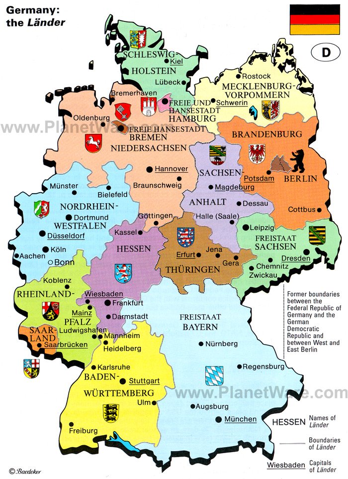
MAP OF GERMANY

Political Map of Germany
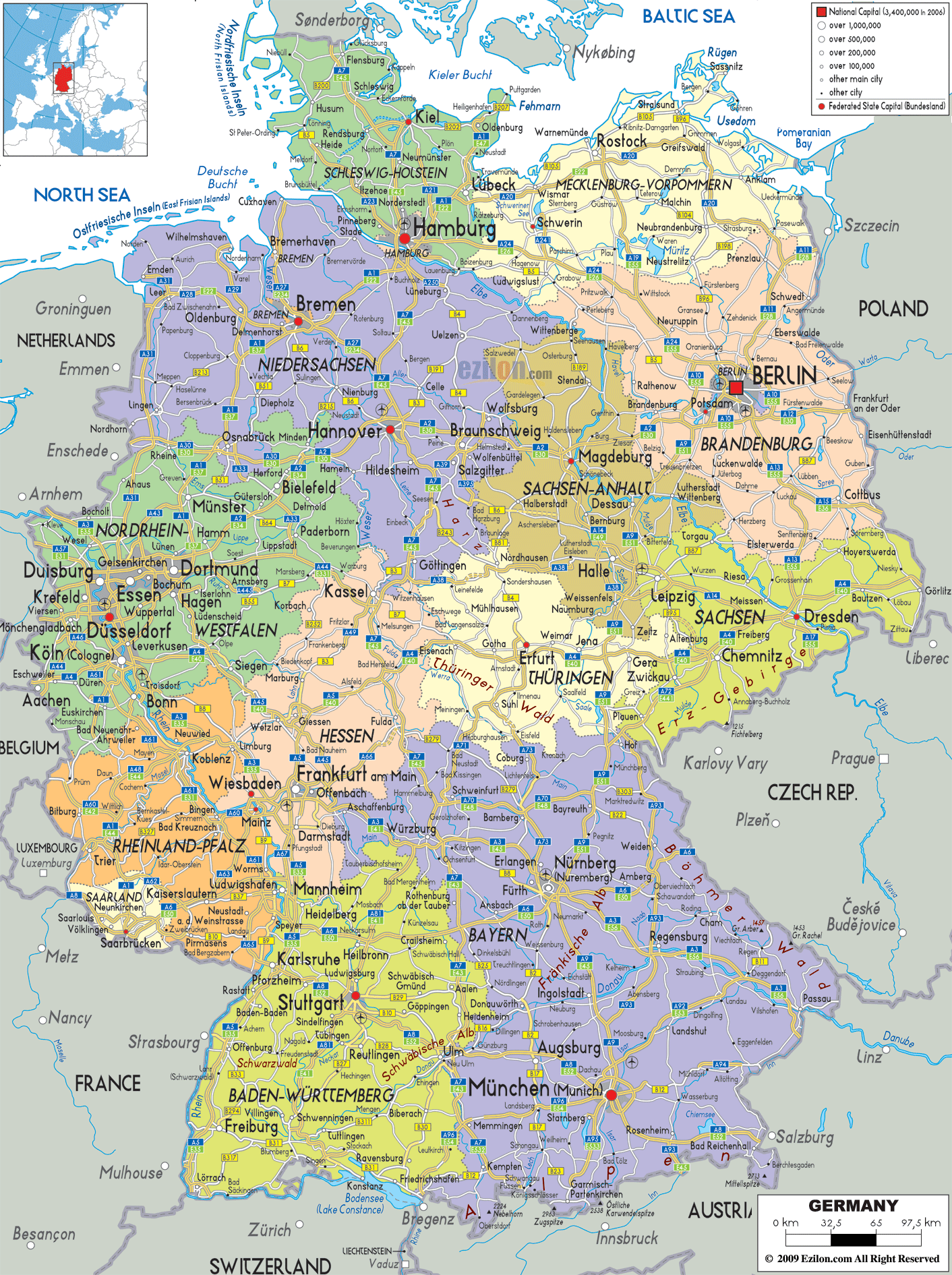
Germany Political Map

Atlas: Germany
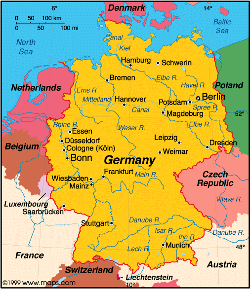
Physical Map of Germany
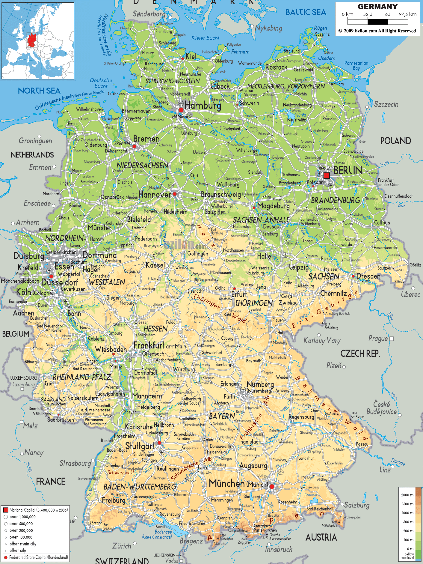
Map of Germany with Cities in English

map_of_germany.jpg

German States and State Capitals Map
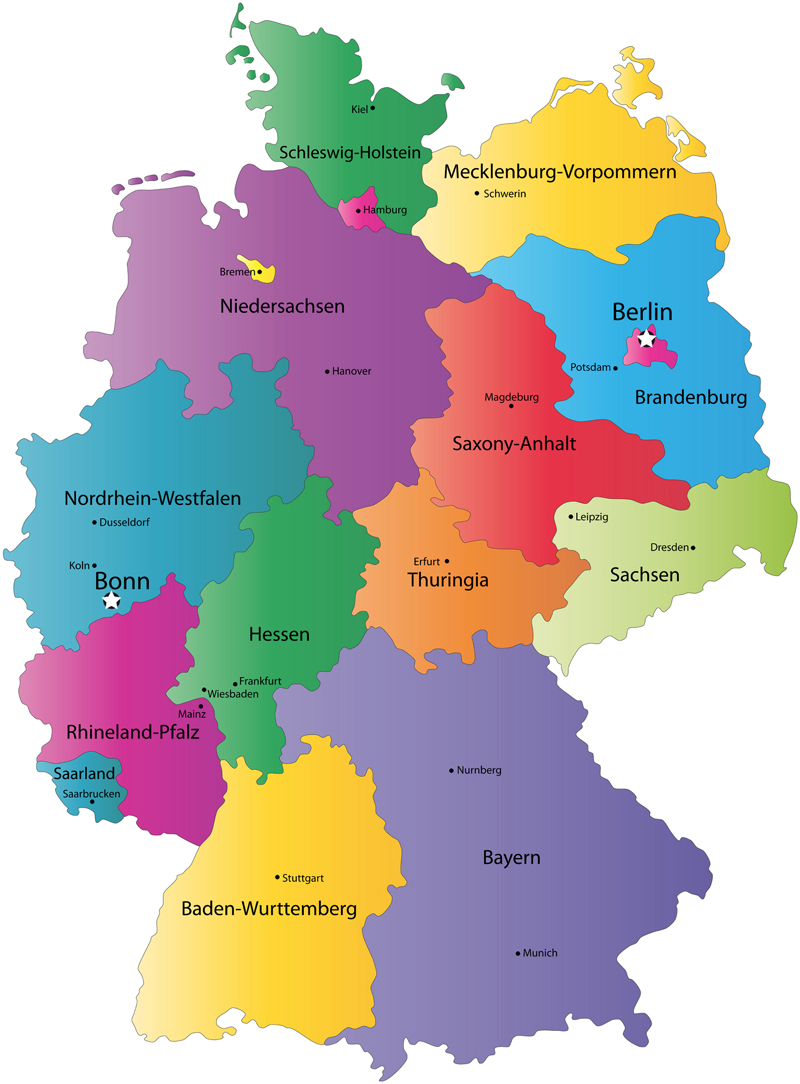
Germany Map
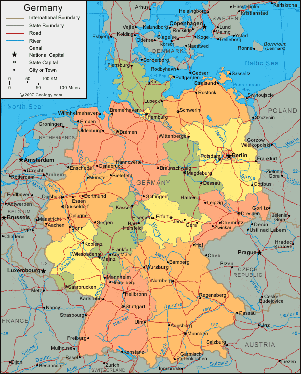
Political Map of Germany
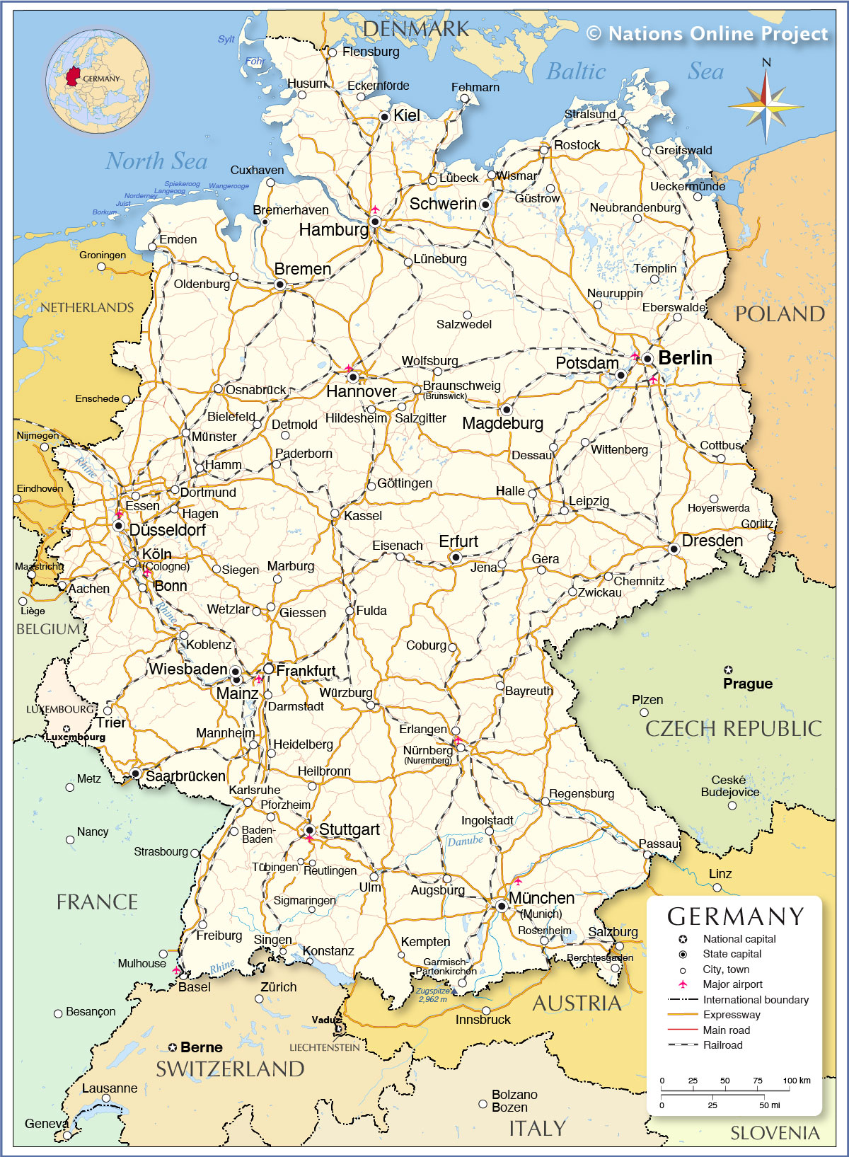
Germany's Population Growth and Decline

Germany Maps

Cities in Germany
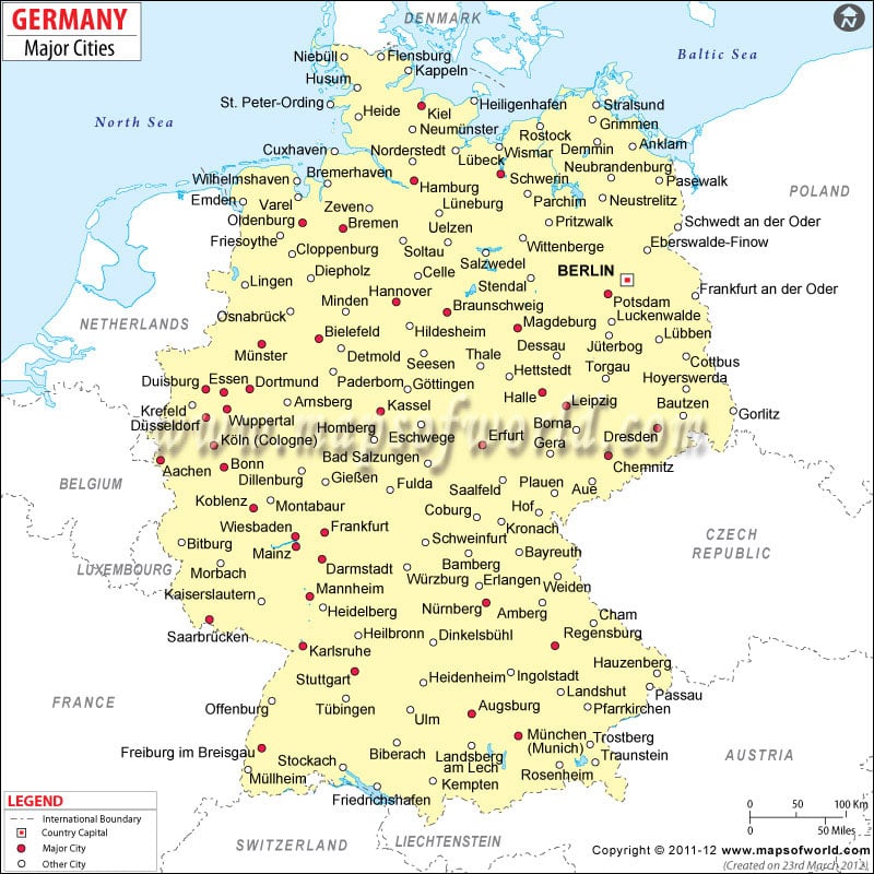
Administrative Map of Germany
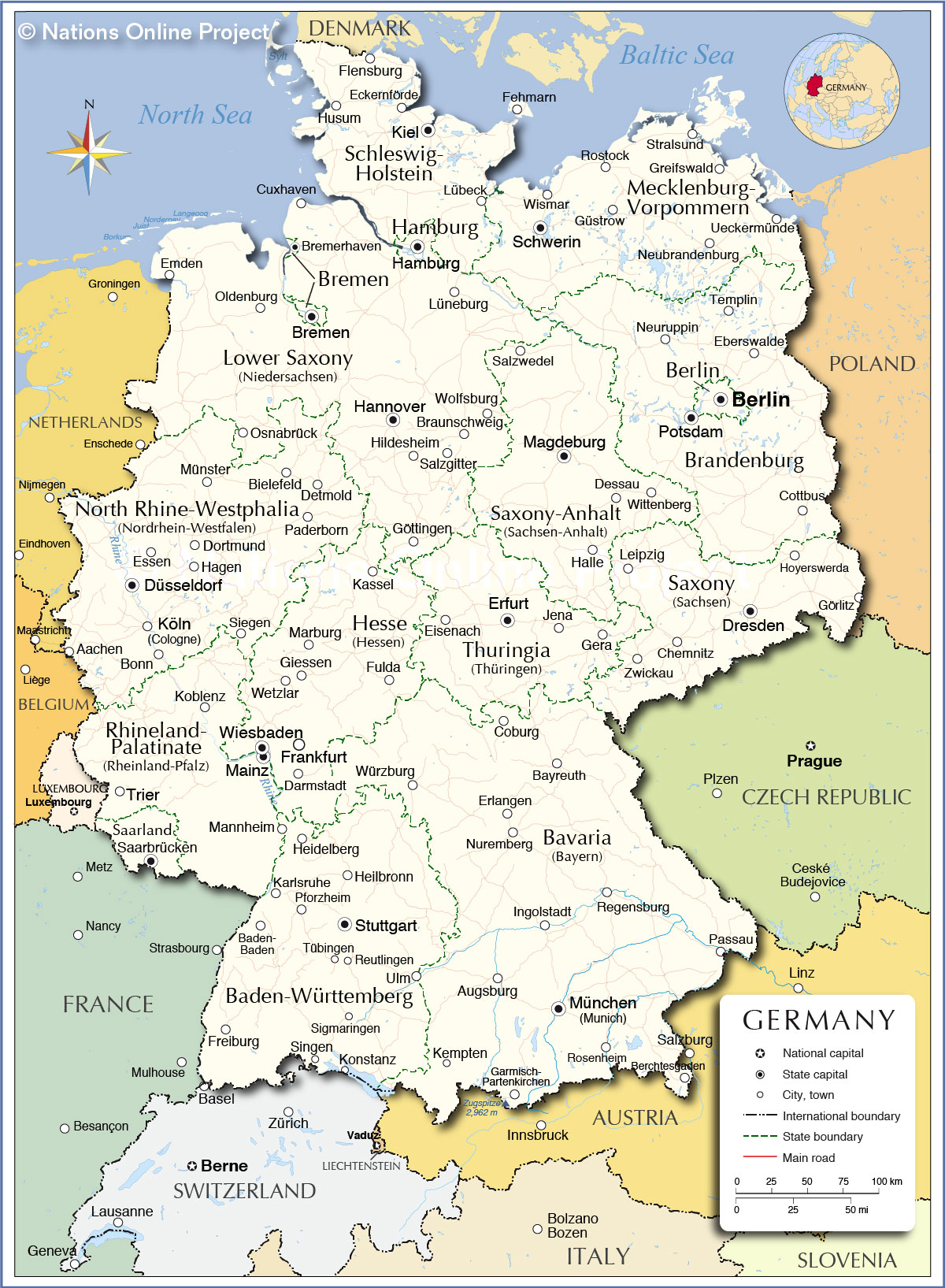
Map of Germany with States amp; Cities

Germany Map / Geography of Germany / Map of Germany
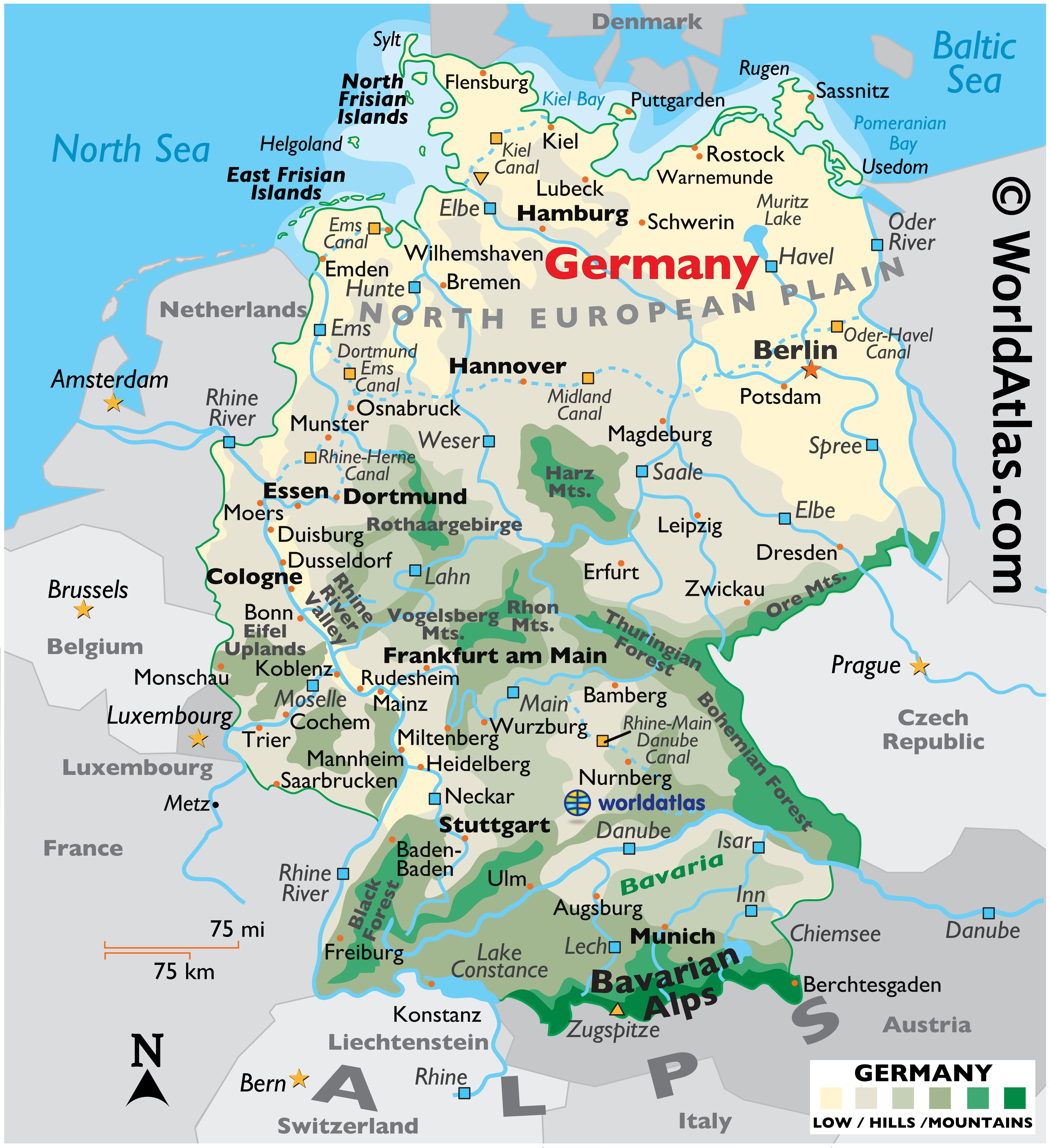
germany
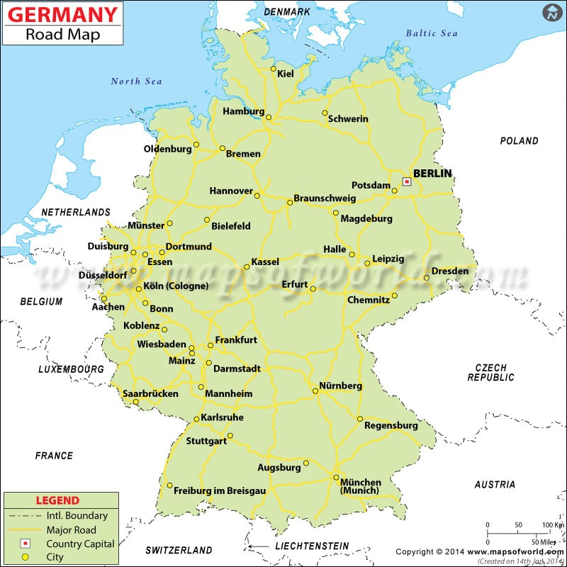
germany
Kaydol:
Yorumlar (Atom)